UFC 1 Rebrand x Short 5 day brief


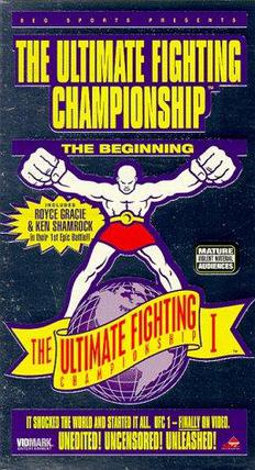
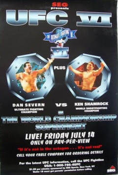
The brief was to create graphic products to promote summer research we did. I decided to promote the first UFC event ever, as my research was mixed martial arts. The first UFC event had an aura of a spectacle but comparing early UFC posters to posters from Japan and Pride Fighting Championships shows a huge difference. The UFC posters remind me of a
n old mega drive cartridge box, While the Pride FC posters look pretty classy with nice concepts.

I tried to rebrand the first UFC to make it a little more smarter, and reference MMA's roots in Japan and reference old prize fighting posters to add a touch of legitimacy, something the UFC struggled with.

This is a sort of customer pack that would be sent out to customers who purchased tickets to the first event. It was interesting to imagine myself designing something in 1993.


UFC 1 envelope x Graphic product

Dimensions:
170 x 250 mm

So this is big enough to house:
UFC ticket: 130mm x 60mm
UFC Poster (folded) 140mm x 230 mm
Octagon flyer: 150mm x 150mm

I added a little extra to give it a little bit of space to open and be easy to take the contents out of. Hopefully it will be ok

Here is the net and the A2 print sheet ready for print.

I've simulated the colour of the stock in one picture to get an idea of how it will look on the bulky newsprint I will use.

Still undecided to see if I'll use a whiter colour for the ticket, and maybe the flyer too. Probably have to try it on different stocks


It's a very simple envelope package. I didn't want to put any more information on the envelope and didn't want it to be too experimental, I wanted the poster to be the graphic product which is the most interesting to look at and the one that is the sort of surprise when you would interact with the package.

It's simple an address on one side and the side you see when opening the envelope has "UFC: The Beginning" written on it, and then you open it to see what's in side. I chose this order of digesting the information on purpose as UFC: The Beginning makes you realise what's just come in the post and now you want to find out more. You're excited. The ticket you ordered has come.


There's also little Octagon (well..half) shaped cut-out to help your fingers get in and pull the stuff out.


UFC 1 ticket x Graphic product

This is my graphic product, the ticket for the UFC event in 1993, imagining this is 1993 and you've ordered a ticket to the first UFC event ever and received a sort of welcome pack including a fold-up Octagon cage flyer and an event poster.

Dimensions: 130 x 60mm


Here's the finished version (Above) I added semi circle cut-offs on the horizontal ends of the ticket to make it a little more like a movie ticket, to add to the spectacle vibe I want to put across. Pretty subtle, doubt it's the first thing anyone will pick up on but there you go.


The seat numbers are obviously made up but the event details, time and venue are correct. As is the date, Saturday November 12, 1993.

Obviously in the 1993, enquiries were more often probably done through the phone rather than the internet so I've put up the UFC's phone number instead of the website.

Nowadays the tickets are around $500 but I took into account it being the first UFC event so lowered the price a little bit. I couldn't find anything on the ticket prices originally unfortunately.


Flyer - Fold up octagon x Flyer

For my flyer, I decided to make it able to fold up in the Octagon, the UFC's trademarked name for the octagon shaped cage!

I thought it would be a cool interpretation of a flyer and the octagon base gives a good space to contain information on.

The idea is one side the flyer will have the information on, with the cage sides having a net pattern on, including the flaps which can be fold up and stuck together to make an Octagon cage. Giving a little bit of fun and longevity to the package. It's 1993, the UFC's first event and people would want to know more about the concept. Including where the fighters fight, so this could be something cool to keep on a desk or something as a bit of free merchandise. Hopefully it'll turn out ok!


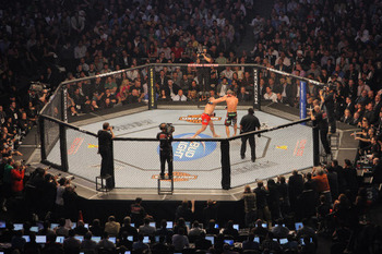
This is a photo of the Octagon. Also gives a good idea of the dimensions. 


It's also worth noting, the design of the cage has changed. At the first UFC event it looked a little different. with slightly different padding and stuff So this is the aesthetic style I need to go for...


Here's the basic net I've drawn up. the flaps on the side will now have a cage pattern overlayed on top, including the flaps so when they're stuck and constructed they'll still blend in with the cage. It'll be up to the maker if he wants the flaps on the outside or inside, they'll hopefully blend in reasonably well.

One side of the octagon base will have the textual info, of the mail-out, what's attached in the package and thanking the customer for ordering the first ever UFC event.

The other side will have more cage patterns and a UFC logo for the cage. As there is in real life, along with loads of sponsors.


Cage pattern on

Base of the Octagon is 100 x 100 (mm)

Cage sides are 23mm in height


Info side on the left and the other side of the octagon flyer on the right. When it's folded the right side will act as the base of the octagon with the logo and "the beginning". As that's how you would see an Octagon floor looking a little bit like in real life.


UFC 1 Poster

I've been working on the UFC 1 Poster. I decided I would do this first as it will allow me to get an idea of where I'm going with this visually, so I can apply this to the ticket, flyer and envelope products.

I wanted to reference the original UFC Posters and also take a leaf from Pride FC's book, here are the references.


Another consideration was, this is set before the UFC's first ever event. There will not be any imagery from an event, which hasn't even happened yet. At the same time, I needed some stock imagery I could use for the poster. I was looking for something which gave an indication of what the event was about and also a nod to MMA and UFC's influences. One of which is Vale Tudo fighting, a similar no-holds-barred 'no rules' fight sport.

I used this picture of Rickson Gracie and Rei Zulu in a Vale Tudo contest from the 80s


Poster MUST Include following information:
  • UFC 1
  • The Beginning
  • The No-Holds-Barred Extravaganza!
  • The Most controversial event of the decade
  • Featuring 8 of the greatest fighters in the world
  • There are no rules!
  • Venue
  • Date
  • City


I wanted to also reference  prize fighting posters from many years ago to give the UFC event a classic feel, to add legitimacy. Something the UFC struggled with at first. For example this one featuring Muhammad Ali


I also wanted to make it look quite 'corny' as well with the layout and overload of information, something you can probably imagine plastered to a wall in a barbershop. Just everywhere.


Here's what I came up with.


The following two, I tried to make it a little more experimental with the colour, overlaying a gradient over the top. I'm going to print onto the stock, with no background fill. Never liked those! Prefer using the stock as the background with text and cutouts over the top, printing in layers like a screenprint. Just how my references were probably printed. Especially the Ali poster.


Wasn't too sure about the colours on this, might 


I actually quite like this, I think it adds maybe a more contemporary experimental twist to something I was designing to look old and retro. I'll keep this approach in mind and maybe apply it to the rest of the branding afterwards to compare.


I went for a long vertical poster as I just thought it'd be cool to reference MMA's roots, in Japan. With a long vertical, scroll like poster. This will fold up vertically and be inserted into the envelope. Like so...


A History Of... 3 Graphic products. Initial idea

As part of a task for this Wednesday and for the web element of the module regarding the summer research, we are designing 3 'graphic products' to promote the research.

These need to be:
 A non-A format poster
Creative interpretation of a flyer
Any graphic product

After a bit of brainstorming I decided to rebrand the UFC, more specifically the first UFC event ever. UFC 1 back in 1993. Back then it was simply called "The Ultimate Fighting Championships" and had a different concept about it. It was about a no-holds-barred fight. A fight to see which fighting style is superior, from boxing to karate. It wasn't more of a sport like it is now, it was more of a spectacle.

From my research, I always thought the way UFC was branded was really different to Pride Fighting Championships in Japan which had a much more cleaner, more 'graphic designed' aesthetic to it, regarding space. I wanted to take this approach to the firat UFC event and create less imagery of manly men and rock music, and more imagery of a spectacle. Somewhere you might even take your family to see what it's about.

For example, compare an early UFC poster to an early Pride FC Poster. A lot of difference:


I then decided if I was going to rebrand an event from 1993. It would make sense to go back to 1993 and imagine how it would all work. I decided to create a mail-out package to customers who ordered ringside seats to the event. At this point no one would know what this UFC stuff was about, there was no prior references.

Obviously, Internet wasn't all over the world in 1993. They probably sent out tickets or you bought them on the day, instead of ordering online and printing the ticket out or whatever. So the idea of going back to 1993 and branding the UFC and it's first ticket packages is quite interesting.

So my graphic products will be:

Graphic product: Envelope, mail product
Non-A Format poster:  (230mm x 550.5mm) UFC 1 event promotional poster
Graphic product: Flyer which folds up into the Octagon UFC cage
Graphic product: UFC 1 ringside ticket