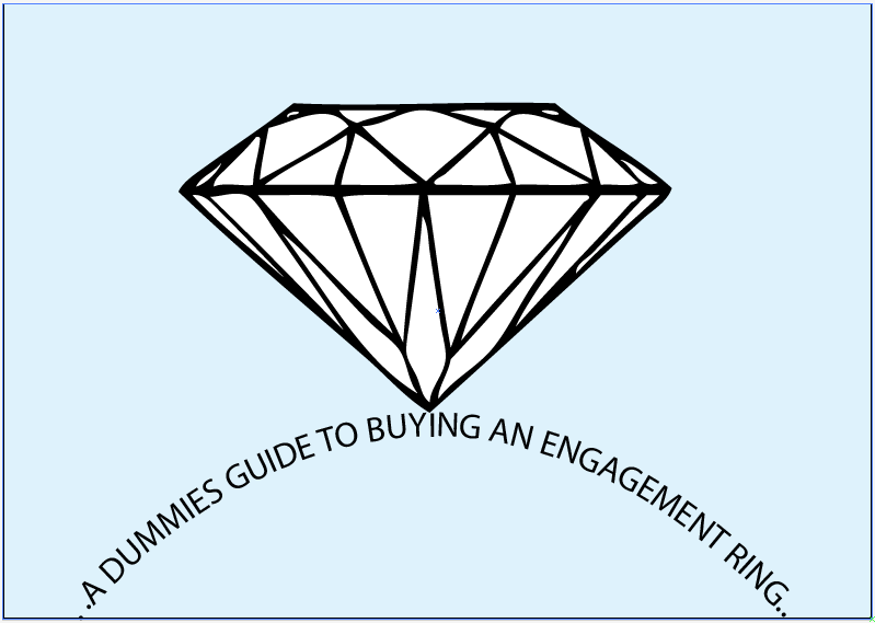
How to buy an Engagement Ring
How to..
Things that could be included into the leaflet/booklet:


 I faded the opacity so that the lines were stronger and you could see more clearly the light performance.


 I then put this on the blue background in which i'd faded the diamond image in different sizes and scattered around to add a bit of detail to the page. Using lines i broke up the text so its not so harsh on the eye in amount on information. I also changed the opacity on the diagram again so it was stronger than the background but didn't compromise the lines.


 I then added the background and faded diamond shapes as well highlight some important facts in bold.


 After seeing the shapes with white fill and no fill i felt that they'd look better with fill.


- buy and engagement ring
Audience..
- men
Purpose..
- inform
- instruct
- educate
Things that could be included into the leaflet/booklet:
- The woman's likes/dislikes eg. colour of jewellery (white gold, gold, silver, platinum), style of jewellery (traditional/modern)
- What's best for her hand
- Shape
- Setting
- Her lifestyle
- Ring size
- Set out a budget
- Loose Diamond? Shop together
- Cut
- Colour
- Clarity
- Carat Weight
- Cost - negotiate
- Certificate
- Care
- Jewellers - trade associations
I initialling tried designing a simple example of what could be the basis of the front, trailing different amount of text and font size.
I started by creating a diamond by live tracing an image and then placed it on a cool blue background as i thought due to its calm, clear and cool attributes it'd fit nicely with the theme. I then created the ring shape from the text and varied size and amount.


I then used a image i'd found during my research and the diamond i'd already created to create my own diagram of the different cuts.


I tried various fonts on the blue background to see what could work well for the titles and text.

I drafted up a mock page for 'Cut' using the diagram image i created and the information i'd found simplified down which included key points(what the cut is), the various quality of cuts(the light performance of cuts) and then tips and hints for the man to help aid him in decision.


I cut down the information slightly and boldened key parts in the hints and tips to make it stand out as information to take notice of.

I did a similar process for 'Colour' and created a little diagram using the same diamond image editing the colour to the scale.


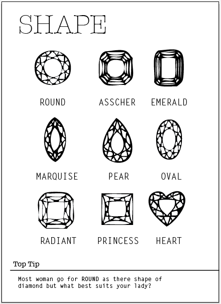
I followed the same process through for 'Shape' which doesn't need much written information.


I magnified the diamonds and uses crosses as a visual representation for the change in clarity.

Clarity information page

This is my groups work and the overall finished concept
Our chosen head title and subtitle fonts:
Test:

Logo development by abbas:


Website Making by Sam:

Home page

Shopping guide booklet option

Download app option

a few sample of our app icons:

App pages:


Lukes page layouts for style and setting following the same simple design logic


in the app:


Emmas shape designs following our chosen style
in the app:


In practice on the iphone:


all the app pages can be seen HERE
Booklet development:


0 comments:
Post a Comment