Position absolute, left 0px aswell to get rid of borders. Position relative is slightly different coding.
left 50%
right 50%
margin left: is half the width of the container, to make it central, in this case 1024÷2=512px
Ideally before creating a multipage website you would create a DWT - Dreamweaver template first. You can convert HTML pages into templates. If you have pages branching from the template, making a change to the root template automatically alters the linked pages too.
Navigation is consistent across all websites, so the area which changes is the 'editable region'. To specify an editable region, click after the close brackets in the relevant section, in this case column 1 in the HTML view and click on Insert>Template Object>Editable Region and give it a unique name
Editable regions for all 3 regions...
You can now save this as a template, so the columns are flexible editable regions and navigation stays consistent. Never save the name as INDEX, it will confuse everything. Call it "template"
Template sub-folder is now created with a .dwt template inside it
Delete index.html from user work, go back to Dw and refresh. Reason for this is to have a new index page which is created from the template, as it HAS to for a working website with template.
Create a new HTML with Template link. File New, New page from Template and save a new index.html
5 pages created, file new, page from template each time.
The Index Page IS the landing page, and homepage, so don't create an extra homepage.
When creating a website, you would create a html template, create a HTML and CSS as we have already done, so create a template and then create the pages from the pages quickly.
Now, need to add content. SO go back to the DWT template and add buttons which help you navigate around
You can use simple text, or use rollover images. Where it changes slightly when rollover with a mouse.
All you need to for a website is to create a html template using CSS, and create pages for the website from the templates with consistent layout template.
As a web designer you need to be aware of file sizes, for example a print resolution will not only take ages to load up but could completely use up someones iphone data allowance. Images should be Kb's not MB's. Along with that you pay for bandwidth, when creating a website for someone you may sort out the hosting and bandwidth for them. Size of your website should be no bigger than 5mb.
When looking for a place to host your website look at the price and make sure it's in the UK.
Converting images to be web safe
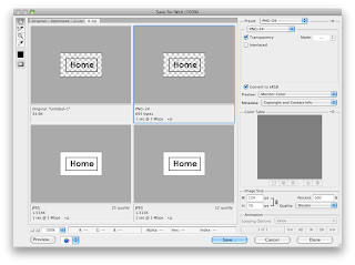
About 250kb, leaving you space for about 20 images before 5mb is up. Can still make it a little smaller by clicking on "File Save for Web"
You can see the original is 211k and it even gives you the time it will take to load up on dial-up internet and compresses the colour palette as you can see on the right.
Click on arrow and change to 1mb internet, you can also change file-types you can save as. So you can save as transparent background PNG's if you need.
Quality 50 is always a decent shout, this is only 20.53k now at the same dimensions as the original which was around 250kb.
Save in root folder and images folder and make sure you give a nice short concise filename,
Get rid of where it says "left column" as this will be seen when on the web.
Alternate text is for partially sighted people so when hovering over, the screenreader speaks what you wrote
creating navigation rollovers
Navigation is 620px wide, divide by 5, 124px wide and height of 70px.
When working with solid colours, it's better to define and in terms of file size, to create a transparent background and specify the background colour in the CSS, also will be more reliable
As this will be consistent across all pages we will put these into the TEMPLATE and not separate html pages.
HTML isn't capable of loading images by default, for this Javascript is used. We'll look at this in next session, JS is reallycomplicated but DW does the hard stuff for you
5 rollovers specified within the navigation div.
The 5th buttons gone missing!
The rollover works which is good, the button nudges.
Make sure you save all separate htmls for them to update and make sure you save and click update pages when saving your template.
With mine it's added a little 2px gap between the buttons, pushing my 5th button down, I will need to put in separate specified divs to really have control.
For next week: Bring images and final scamp for MMA website I'm going to create.


.jpeg)


0 comments:
Post a Comment