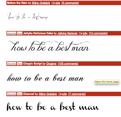
At the moment, we seem abit stuck between going down the how to buy an engagement ring route and how to be a best man route,
Here's some shots of the process of making it. I quite like the little emblem I made for our workgroup, I quite like the effect of having it in the corner as a sort of slick little signature. If we have time, it'd be great to get it pressed, rather than printed for a cool embossed touch, but worry about that later!
Here's some process pictures.
Here is the 'logo' I made for now, a sort of letterhead. In the end I went for 'Ballpark Weiner' I wanted a sort of fancy, laid back but still quite decorative font to contrast against 'AND SURVIVE'. Sort of like, all fancy and then the serious bit hits you with a serious typeface. Whether this is the effect it has on everyone and not just me remains to be seen - but it was a conscious decision on my part.
Here's the emblem/badge for our workgroup. Incorporationg the initials A, E, I, S, L. Abbas, Emma, Imogen, Sam and Luke.
Here's a close up for the checklist. Went for a more playful, handwritten font to emulate how a person would write them maybe? But also not to look tacky and still quite suave and I think this kind of works. Legibility may be an issue though, but as I said, just a knock up at this point.
Here's a bit of the note section that would go on the write. Looking back on it, I'd have ruled lines, rather than dots. Dot's dont really say 'write' as much as lines do maybe and they're quite eyecatching, something I don't really want for this section.
Here's how it looks as a one-sheet.
Now onto the other side, it's always helpful to make a knock up net (as I did in the post below) as it helps you get an idea of what each sides net should look like, especially with folding, you sometimes get bits which need to be printed upside down or at some weird angles - so they look right and in place once folded. It's always good to make marks, and then unfold so you know how it all works together, I find.


0 comments:
Post a Comment