FILM POSTERS OF THE 80S
Posted by
Abbas Mushtaq
on Tuesday, 3 January 2012
Labels:
100 Things,
OUGD405
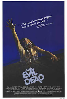
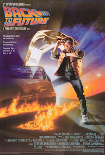
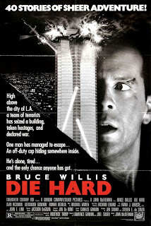
The modern template for a film poster starts to take shape. The top 2 thirds are generally the main image/stars. The bottom usually holds the film title, tagline and credits at the bottom, usually in very small block text. The themes of the movies changes. 80s were big on action films, buddy cop movies etc. Bruce Willis, Mel Gibson, Van Damme, Arnie all thrived in the 80s. Obviously there were many other movies in the 80s, but in my mind the 80's reminds me of action, miami vice, electronic music and michael jackson.
In the 70s, photography and photoediting started to take prominence over handdrawn, painted imagery. In the 80s it's basically all pretty much photoediting and manipulation for a photorealistic look. There's less abstract imagery with a cut and paste look. The manipulations usually create scenes, usually consisting of the main stars in full focus close up. Also in the olden days, many different artists had different takes on the same movie. Now, there are less variations and they all have pretty much the same aesthetics and style, as it's not hand drawn so less noticeable.


0 comments:
Post a Comment