Some notable film posters of the 50's. All carrying their own certain style and recurring features and styles.
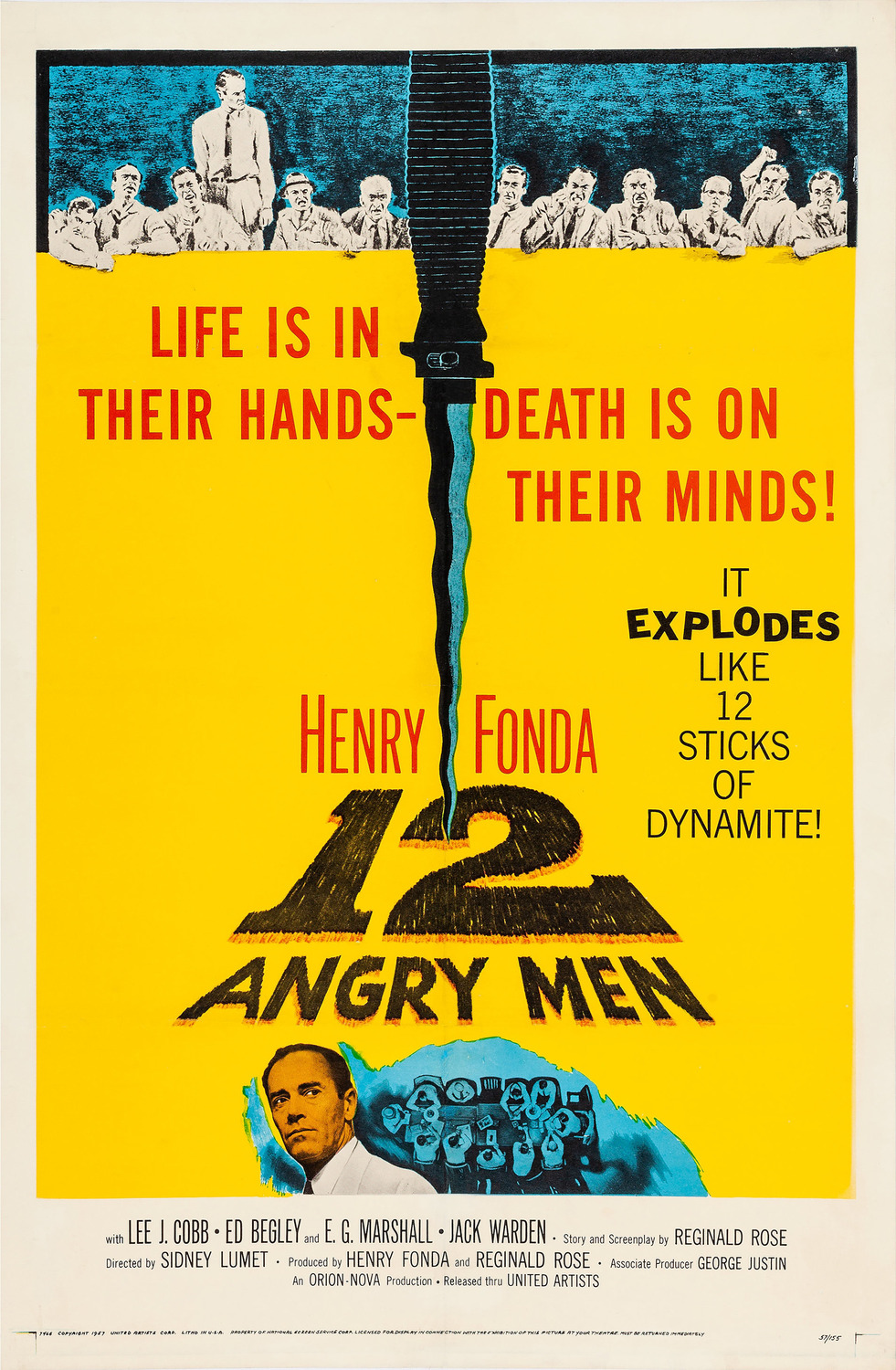


(such a good film btw!)

Would be really interesting to create something distinctly modern and a distinctly modern sci-fi kinda movie like transformers or something but in this style, clash of styles. Would look quite interesting.

Back in the 60's and 70's posters used white spaces and motifs alot, they weren't scared to have a cut and paste look with block colours and illustrations tied into it. Very interesting and very effective in some cases. This doesn't happen much now.

girls were usually the 'damsel in distress'

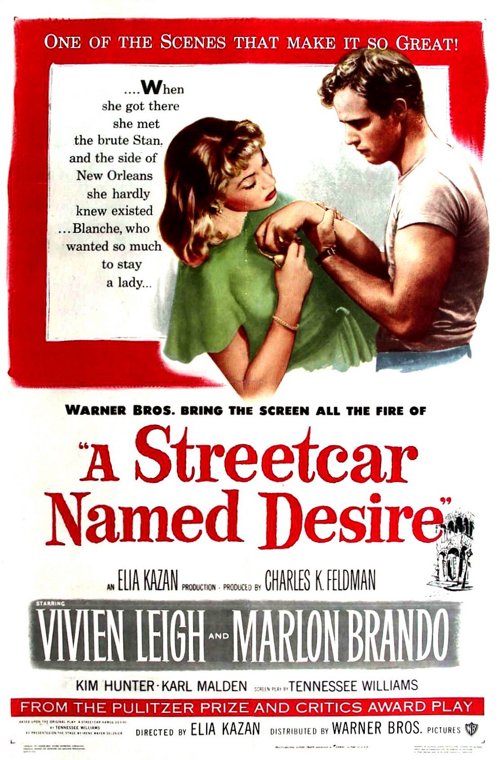
Even here it's a painting, where a photo could have sufficed! They really didn't like cameras it seems.
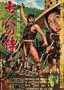
Really like this for some reason. It's just different, simplicity is ALOT harder than it looks.

Classic work by Saul Bass, a favourite of mine. I'll go through him more in depth at a later date as he really inspires me.

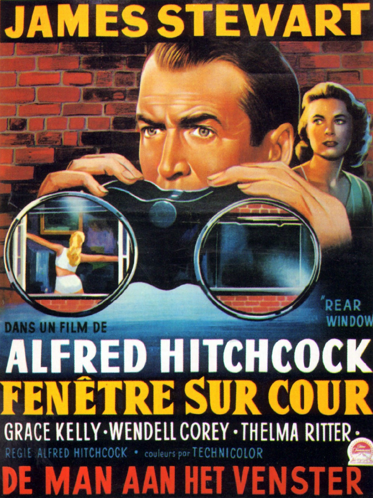
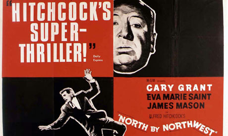
This is really cool too. Love the use of a real photo of the star but hanging on to, well, space, but still equally as effective and it lets your eyes know where to look. If the background was all ugly bricks it wouldn't look half as good. All the colours work well, can tell there was alot of thought with colour. and the use of black and white stills on top of colour.

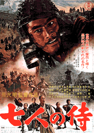
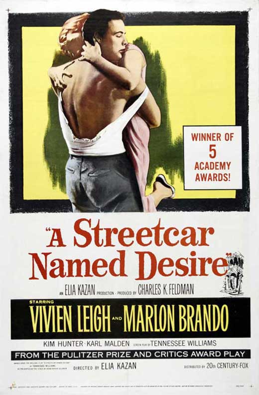
This is juse really nice, so simple so effective. I think it all comes down to the fantastic painting though which does all the hard work, especially the face expressions.


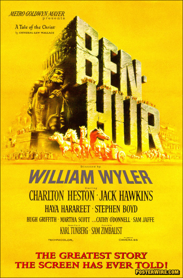

"the greatest story ever told". Quite a direct way of selling a film, nowadays they have quotes from writers and articles etc. Here it's like they're trying to sell you something in person and tempt you. THE GREATEST STORY EVER TOLD! HEAR HEAR! This is interesting. I like the massive block text, almost crashing into the ground, to suggest the massive epicness of the film.
Overall the posters have a playfulness and handmade feel about them. Even if the lines are straight etc, nothing looks perfect, everything looks really sort of full of character and moving, even if it's all probably lined up on a grid, it still has more of an unpredictability about it. The first North By Northwest poster I posted is a pretyt good example. If the same thing was done on a computer with a grid it would look a lot more regimented and lifeless. Stuff like this would be really fun to screenprint to add more imperfections to it which really add to the overall feel, I think.
0 comments:
Post a Comment