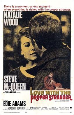
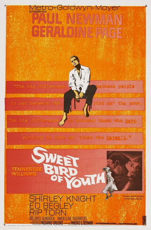
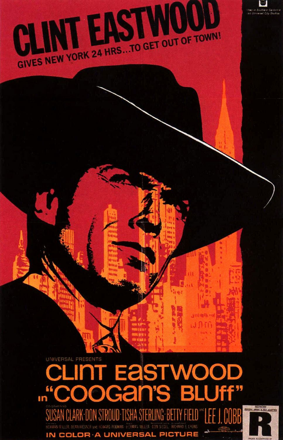
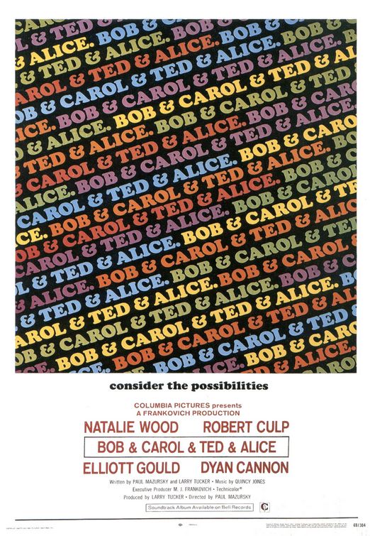
Here are some notable posters from the 60's. The 60's carried it's own recurring styles and aesthetics. Women were much more sexualised than they were in the 30's. Obviously 30 years is a long time, there was alot of social and technological and these film posters do reflect that. Here's some that I quite like from the 60's.
Still prominently hand drawn and traditional approach to making the actual images. If photos are used, there's a very cut and paste, montage kind of aesthetic to it. Big use of block, solid colours and the main star of the film is placed prominently as the focus.
*The small print that is 'small print' nowadays, e.g. credit, publishers, stars, directors etc is prominent and part of the composition and is bold and clear. Nowadays they tend to be extremely small and block text and placed on TOP of the poster, rather than part of it, in most cases.
Posters for the same film can be distinctly different in art style, seems more individually driven with artists tasked with the design of the film poster and each one has their own take on it.


0 comments:
Post a Comment