Colour
- Colour intro
- Colour modes / RGB and CMYK differences
- Process Colours
- Spot colours
- Pantone colour matching systems
- Tints
- International/Other colour matching systems
- Glossary / Key-Terms
Colour
Colour is an incredibly important factor to consider for a graphic designer. The ability to use colour correctly can make a piece of work really stand out, knowing what colours work well together can make or break a piece of design. The use of colour efficiently and knowledgeably can product accurate and consistent results.
One of the things a designer must consider constantly when designing is what colours are being used and what plates are being used, you don't want to use any extra colours and plates which you don't really need. A cyan shape may have a 5 hint of yellow in, is it really worth the 5% yellow and extra plate, essentially double the cost? Designing a print to be cost-effective is understandably important for both the designer and especially the client. These are factors designers need to constantly consider.
One of the basic issues a lot of designers have is colours looking different on screen than it does when printed, this book will hopefully eradicate any issues in the future. This book will give an introduction and basic outline of different colour modes for screen and print. Process colours, spot colours, tints and colour matching systems such as the Pantone Colour Matching System which is probably the most widely used system in Europe and the World, along with other International colour matching systems.
<example of RGB and C M Y K shapes?>
<compare C100 M Y5 K against a C100 M Y K to illustrate the point about colour and plates.
Colour Modes
In design for print, the colour mode you need to produce work in is very simple, it's always CMYK. CMYK stands for Cyan, Magenta, Yellow and Black. So why does "K" stand for Black? The "K" for black sounds for "Key" The reason for this is the letter "B" was already being used to describe RGB. The basis behind working in CMYK is you have 4 seperate colours, cyan, magenta, yellow and black which during the print process are applied in pin-point accurate layers in order to produce the image you require.
CMYK is a subtractive colour model. Which means it works with an absence of colour, using transparent inks to create full colours. The CMYK model works by partially or entirely masking colors on a lighter, usually white, background. The ink reduces the light that would otherwise be reflected. Such a model is called subtractive because inks "subtract" brightness from white. When all of cyan, magenta, and yellow are combined it makes a muddy black. Imagine cyan, magenta and yellow being tubs of paint and you paint images by mixing the colours with pinpoint accuracy to produce pretty much any colour you need. CMYK is all you need to consider for print. Make sure you're always working in CMYK colour mode when designing for print.
RGB on the other hand is solely for screen. Screen, obviously isn't real life, it's not actually 'real' it's pixels coming together to form images and type. RGB is an additive colour model in which red, green and blue light come together to produce an array of colours. RGB is device dependent, as depending on the device itself the lights can be mixed varyingly and come across differently with many variables such as even the screen quality itself. Whenever designing for screen, be it a website or designing images for web, always work in RGB and make sure your colours are web-safe, which means safe and representable accurately on web. Just as with light from the sun itself, red, green, and blue combine to make white light. Making it sort of opposite to the CMYK colour model.
RGB colour mode can produce much more saturated and almost flourescent colours than CMYK as it involves the use of light which is much brighter than what is possible with physical CMYK process colours. So RGB has a wider gamut than CMYK, gamut means range of colour. Gamut's can vary depending on the print process, for example offset printing and injket printing have different ranges of colour.
<gamut subheading plus definition>
CMYK and RGB pics and GAMUT pic


The term "process colours" referes to CMYK colours. They're called process colours as they're the colours which are involved of every printed material, no matter what print process you use, be it an inkjet or a professional scale lithographic printing job, you will always see the printers have separate cyan, magenta and yellow inks forming in varying levels layer by layer to form an image. Sometimes process colour is called "four colour" which is literally the same thing.
To create any photograph, the photo is printed in 4 layers of C, M, Y and K. If you magnify closely enough or look through a magnifying glass you will be able to see that the photo is actually made up of tiny little dots, usually unidentifiable at seeing distance. This printing process is called halftoning.
Tiny dots of each primary color are printed in a pattern small enough that human beings perceive a solid color. Magenta printed with a 20% halftone, for example, produces a pink color, because the eye perceives the tiny magenta dots on the large white paper as lighter and less saturated than the color of pure magenta ink.
Without halftoning, the three primary process colors could be printed only as solid blocks of color, and therefore could produce only seven colors: the three primaries themselves, plus three secondary colors produced by layering two of the primaries.
To improve print quality and reduce moiré patterns, the screen for each color is set at a different angle. While the angles depend on how many colors are used and the preference of the press operator, typical CMYK process printing uses any of the following screen angles:
| C | 15° | 15° | 105° | 165° |
|---|---|---|---|---|
| M | 75° | 45° | 75° | 45° |
| Y | 0° | 0° | 90° | 90° |
| K | 45° | 75° | 15° | 105° |
examples of screen angles and moire pattern>


Screen angles of the CMYK screens, at a distance these tiny dots fool our eyes and produce the colours by overlapping and working together.
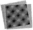
Moire pattern occurs when screens are positioned at wrong angles
Spot colours
Spot colours are individual colours, process colours are colours designed to be mixed with one another at different transparencies to produce different colours. For example a 100% cyan and 100% yellow ink coverage would produce a green. Spot colours on the other hand are ready mixed and are therefore not made up of small halftone dots, they're a flat colour coverage. So imagine going out and buying a green tub of paint from your local DIY shop instead of buying cyan and yellow paint tubs and mixing them yourself to make green. Instead of buying two colours you're buying one. Also to make a green by mixing cyan and yellow to make green, you probably won't be able to reproduce the same exact green next time you tried, even 2% more blue would make it a different colour. Whereas you could easily just go buy the same colour of green from your local DIY shop again. This is the same as a spot colour for print.
Therefore, most logos, such as the HSBC logo, the Heinz green and millions of other examples use spot colours for their trademark colours. Millions of factors have to be considered such as stock and the print process themselves but a spot colour with a reference and unique codename will always be the same, no matter where you go, it comes like that, nothing needs to be mixed. They can also be thicker and much more vibrant than process colours, for example you may have blue stock and require red text on it which really jumps out. With transparent process colours you'll end up with a muddy red, with a spot colour you can really knock-out the stock underneath and make the red jump out.
Spot colours can easily be specified when designing for print, even internationally over the phone to a printer who doesn't even speak your language. Remember how CMYK couldn't produce metallic and fluorescent colours, well metallic and fluorescent spot colours are easily available and can easily be applied. Spot colours require an extra print plate and extra layer. So for example a print job may be 4 process colours + 2 spot colours.
Colour reference systems such as the Pantone colour matching systems are examples of spot colours, easy colour is totally unique and has it's own reference code, these will be the same no matter where in the world you are.

Simple greyscale, one colour black print plus tints and one spot colour. 2 plates?

This kind of vivid red couldn't be produced using process colours on this colour of stock so the red is most likely a spot colour.
Pantone systems
The Pantone colour matching systems are the most widely used colour matching systems used throughout EU and UK. Each Pantone colour has it's own reference code which is completely unique, specifying a Pantone colour is very easy but often overlooked by a graphic designer, we will look at this more closely in the Production book.
<compare two pantones for coated and uncoated stock>
You can see here, these colours both have the same reference codes, but one has a U whereas one has C. This is because the stock also has to be taken into consideration, will it be a coated or uncoated stock? The colours take into consideration the stock onto which they will be applied and how they will look.

Colour systems such as Pantone CMS also include metallics and fluorescents which can really add to your work. These are all examples of spot colours as previously mentioned in this book, ready mixed colours printed on an extra plate and as an added process layer.


You can see the same Pantone references but coated (left) and uncoated (right), these spot colours are from the Pantone Pastel Coated and Uncoated matching systems. Never delete or change the Pantone reference name from your swatches panel when producing work! The printers will not know what reference to use and will encounter problems.
Just some of the Pantone colour matching systems out there:


Tints
Tints are basically opacities of a colour. For example if you have a one colour print + tints, it still uses one colour plate and just applies the same colour in varying opacities to produce the image. This is an extremely cost-efficient and effective way of working as it can make work look like it had more than one colour and more expensive to produce than it really was.
Spot colours are perfect for creating tints from.


Here you can see Pantone DS 138-1 C along with the tints based off the 100% version underneath ranging from 90% to 10% tints. When printing this will still use one spot colour plate and not 10 like it may seem like. Very useful.
Other international colour systems
The Pantone colour matching system isn't the only colour matching system in the world, Pantone Inc. only began as a printing company in the 50's. Other colour systems are more prevalent in different parts of the world.
TOYO colour system's are more popular in the far east and Japan, Matsui, Dulux, Munsell, HKS, Kurabo, Microtek and many more. Pantone is probably the most popular and widely available colour system in the world and growing.
Glossary
CMYK - A subtractive colour system consisting of cyan, magenta, yellow and black inks mixing in various transparancies. The colour mode of choice for print
RGB - An additive colour system used for screen based media regarding red, green and blue light.
Process colours - The term used for colours in the process of printing in layers of cyan, magenta and yellow. Common printing processes such as litho offset will produce prints using process colours
Spot colours - ready mixed colours, printing in flat colour instead of screen angles. Much more consistent than process colours, require an extra plate and layer, can produce metallic and flourescent colours
Tints - opacities of the same colour plate, can add much more variation and visual expense to a product without using any extra colours and processes.
Pantone - One of the most widely used colour matching systems consisting of thousands of spot colours each with a unique reference code so the same exact colour can be specified worldwide with ease.
Halftone - A plate made up of tiny dots, which vary in distance and size to fool our eyes from a distance into creating lighter or darker colours
Screen angles - Angles at which each cyan, magenta, yellow and black plates print dots in. Careful consideration is given to the angles, if angles are set incorrectly it can create moire patterns which aren't nice at all
Separations - The seperations created out of a design, for example a photo may be made up of cyan, magenta and yellow prints. Separations are made of each colour coverage ready for print processes such as litho or silk-screen printing
Sources:
http://www.masterpress.co.th/page1/page11/page11.html
http://websupport1.citytech.cuny.edu/faculty/phenry/gamuts.html
http://en.wikipedia.org/wiki/CMYK_color_model
http://xpedx.edviser.com/default.asp?req=knowledge/article/13
http://en.wikipedia.org/wiki/Spot_color
http://coreldesigner.wordpress.com/2009/01/10/cut-color-printing-cost-without-sacrificing-your-color-options/
http://www.castleprint.co.uk/spot-process-colours.html
http://www.ted.com/pages/creating_your_tedx_logo
http://en.wikipedia.org/wiki/Pantone
http://www.logodesignteam.com/logo-design-pantone-color-chart.html
0 comments:
Post a Comment