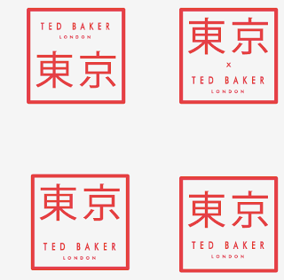
I feel the problem right now is the store looks identical to a store in Britain, along with the branding. I tried to reference the Japanese style, have Tokyo in Japanese symbols and Ted Baker the same.
## Mock-ups
Tokyo = 東京
These look too much like a face!
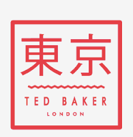
My favourite so far.
Black and red is the colour palette I intend to work with, maybe with a splash of yellow/orange in there too. I'll tighten the colours and typefaces up very soon after a bit of research


0 comments:
Post a Comment