BUSHIDO! :: Flyers


Flyers are a useful product I feel will give the branding photos much more context as a means of distribution in a viral and independent manner, these would be given out to young creatives in the nearby environment to entice a younger demographic.


I've purposely left off the copy when able to and instead given the flyer information on the back so the flyers are double sided and have the feel of quality on thick stock.


These will be piled up in two piles with all products laid out - fronts and backs.


BUSHIDO! :: Letterhead


Been working on the letterhead which would be a document sent out to VIP's with a perforated rip-off ticket which allows special treatment and access when attending the exhibition.


I hope to create a clipboard with an elasticated tie-down method to hold documents in place tomorrow with the letterheads presented on the clipboard


Letterhead size _ A4 _ 210 x 297 mm


Clipboard


Dimensions _ 227 x 329 mm


7mm ridge for the elastic band to tie round


BUSHIDO! :: Ticket reel


At such short notice I unfortunately don't have a print slot to print A2 scale and cant rely on being able to get in there so I'm relying on A3 scale spreads but I think it will pull off.


The ticket is focused towards looking legitimate so I've used the Consolas typeface which is the same typeface often used on receipts and tickets, pretty much anything which self-prints


On all products I aim to always showcase the red, blue and black colour palette. If not through type and image, its through a red and blue gradient which leaves room to only showcase black through the copy and that's what I've done with the ticket.


Fronts

Backs


Ticket with cut marks to give sloped perforated edges on the reel.


BUSHIDO! : Saddle Stitch Attempt

Today's the day when I design everything that needs designing in hopes for simply taking the artwork to print tomorrow and without much finalising, be able to photograph in the studio tomorrow afternoon.

I had plans to saddle stitch but I've never really done it before so was a bit worried I wouldn't be able to pull it off to the desired quality and it could eat up a lot of precious time, so I had a go on a mock booklet and it's surprisingly easy.

I need a thicker thread though, I've been using red string and it doesn't look thick enough and because it's thin and doesn't have as much hold as it could, the pages move a few millimetres which can make spreads look a little disjointed.


This is the guide I followed which was very helpful


Need thicker thread! 


////


Yesterday I was cropping the booklets down which took way longer than I thought it would and made the self-binding calligraphy book which I'm pretty pleased with and feel when photographed in nice vibrant light, will look impressive.

I'm pretty happy with the booklets too I feel it's slowly coming together now.


The inside cover of the black booklets gave me an idea, I suddenly imaged a blank black spread being the backdrop for another mini booklet inside the booklet. So this is what I'm going to do. I'll design a mini 8 page booklet today and print and bind together with the rest of the contents tomorrow.


Calligraphy book


BUSHIDO! Print Progress


Had quite a productive day yesterday when it came to producing products for the Bushido project and focusing in on it again, Here are some photos from the process and print material which I have brought back with me to spend this afternoon binding before taking a step back and working on more design, for perforated letterheads, clipboards tickets, flyers and products like that. 

At the moment everything seems route one and no product changes the way that product has been done before and it's annoying me - mostly because I'm basically flying through it and focusing on the product being done rather than experimenting. I am quite excited and pleased with how a few products have turned out though, the calligraphy book looks interesting and the books have a visual style inside Im happy with


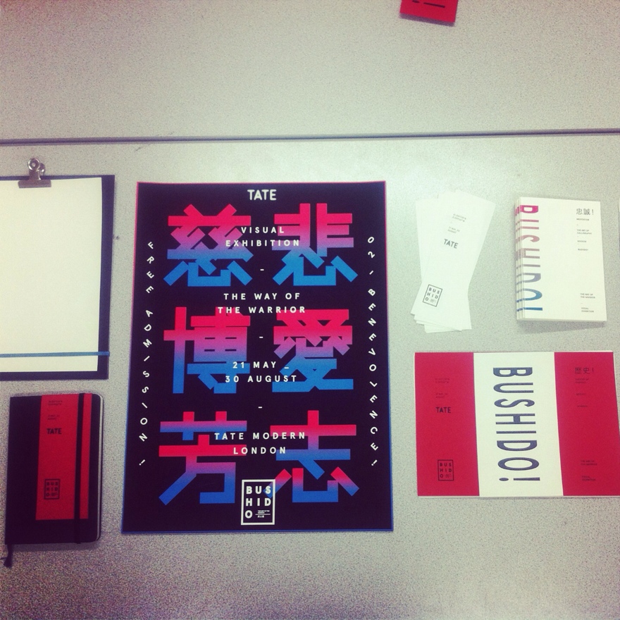
The exhibition at  Tate, London. Aimed towards younger demographic creating a more self-made, indie published aesthetic while still referencing the visual style and formats of Japan to appeal to the young creative. So this kind of 'kitsch' printing and binding actually suits the style I'm going for I feel.


/////


Calligraphy Book 


Happy with the print, printing on watercolour stock is suitable for practicing calligraphy on with ink and creates a nice textured finish, looks just like a screenprint as I propose to do when in mass production.


Front cover


The book is self-bound similar to a copting bound so doesn't need a spine and it creates this cool effect which gives movement. I'm pleased with having achieved my mock-up


Book wrap


This is a mock-up of a wrap I tried to diagonally fold around the book to create desirability as the calligraphy book is the heaviest and highest quality book in terms of feel and usability. The newsprint wrap doesn't really work too well and feels too thin and my rubber bands I plan to use throughout the products when needed are just too slack around it. Need a re-think! Wrapper isn't priority right now so I'll come back to this when/if I have time.


All products as of right now. Theclipboard needs to be redone so a clip isn't needed I feel I can create it in a more elegant and suited way. There will be 7 books, not just the 1 as shown. I've also made bookmarks and a moleskine.


All book material clipped - ready to bind and saddle stitch. 


More planned products:

Ticket Reel
Letterhead, perforated ticket used in mail-outs
Clipboard
Envelope
Possible stamp for stamping exhibition goers
Flyers , similar to posters but double sided on thick stock.


Digital Proposals around London

Wall murals
Viral paste-ups
Bus stop posters aro
Billboards around London

Website
App