BOLLYWOOD BATTLE
Actually got the idea for the name from the last group crit! I think Bollywood Battle works well, it's clear concise and gives you a good indication of what the card deck is basically about. It's about as simple and effective a name I can think of. Don't really have time to think about this anymore, so I've decided to make a logo.
The logo will be on the back of each playing card and on the packaging and any other related product. 2/3 variations, a black and white version (s) and a colour version.
It's influenced by old 70s 'vintage' bollywood typography and posters. I've wanted to go down a more vintage nostalgic route all along but at the same time making it look quite sleak and not too much of a sort of 'fan service' and I tried to find a balance between the two. Here's some reference imagery I used.


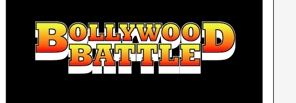
Here are some photos showing the process I went through. In the end I used Rockwell Bold, I think it has the required blocky look and works pretty well. The kerning of the letters is around 10 points with a little less in between the L and the Y to make it look a bit easier on the eyes.


Lining up with the guides so 'Battle' lines up nicely


Think the gradient works well.

On the actual playing card I might incorporate a subtle pattern of some kind, as the text looks like a bit of a throwback to old Bollywood typography I looked at old 70s patterns to maybe give a few ideas.

Needs abit of fine tuning

I used a playing card kind of proportion art board while making the logo so I always have a pretty good idea how it would look on the back of a card. Here I tried a simple line pattern, I think it harms the contrast between the text and the lines,


I actually think this looks pretty decent. It's simple but looks quite sleek. Quite happy at this stage for now.


Here are the two variations I made. On the actual box for the cards I think I'll go for the red and yellow gradient version for the 'full' version and the more eyecatching version. I'll use the black and white one on the cards, to create a relationship between the box and the cards but also a bit of a difference.


I made these on Photoshop using the text manipulation tool. It'd be good to be able to do this in Illustrator, I think it could add to the logo, it's probably still there in Illustrator, I'm just unaware how to. I'll look into this later if I have time because I'm pretyt happy the logo is to a decent standard which I can use, at this moment in time.
Speak soon! Busy times lie ahead
0 comments:
Post a Comment