Web session was very good and coding is surprisingly easy to pick up at a basic level. We translated the group scamp into a working page template using divs containers and size specifications.


meta tags are for search results


Body is what you will actually see on the web page, Title is stuff behind the scenes

Creating a new Cascading Style Sheet. Always choose Basic Template or sometimes Page From Template


in CSS you start of specifying stuff with { and }


Specifying a font family.

This button is used for attaching a CSS sheet to a HTML coding document. In this case the font family is all that's specified so it changed the font on the site preview.


You can see above it's now in Arial in preview.


The container is now going to be specified. The container is the actual site = 1024x768


} to signify end of specifications for the container.


Back in HTML with the linked CSS sheet it doesn't know what it's looking for as it only understands Body and Head. Need an identifier. Need to add a # before container in CSS
so it looks like
#container {
}

Now back in HTML it now picks it up.


Here's how it looks in Preview with an eggshell colour of #E6EACE

The CSS elements in HTML code seem to be highlighted with the more saturated blue.


Navigation div link inside the container div. as the navigation will obviously be inside the container, in this case the website element itself.

The 3 column specifications inside the CSS sheet. You can see column 3 is slightly wider by a pixel as 1024 doesn't divide exactly by 3.

This is how it looks now though as the columns are all left aligned and don't know where to go so just tile underneath each other.


Need to make the container also not have a white border at the top and left of the page, so make the position absolute. Absolute basically works with co-ordinates so it goes where you tell it to and stays there.


0 pixels left and 0 pixels top. So it's snug in the corner.

Done.
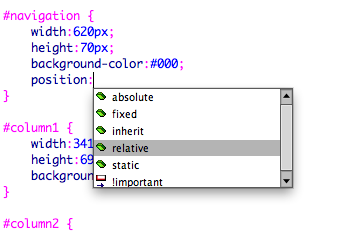
The navigation needs to be relative to the container itself so it's flexible and isn't rigid which could lead to problems. So extra code was added to be relatively positioned and FLOATING left

The same relative positioning applied to the columns too.

Now it's a little better but we don't want the columns going over the navigation they need to neatly fit underneath like a jigsaw. To get around this we added margins to the left and right of the navigation so they act as sort of invisible barriers.
Scamp came in really handy here as all the numbers were done, fits together like a jigsaw.

margin left and margin right of 202 px.
Always close sentences and specifications with a ; and close the div id's in CSS with a }

Works!


Went back to the CSS and simply changed the colours to blue white and red to make a France flag to see if I understood the basics and it worked. Didn't think I'd enjoy web so much.
0 comments:
Post a Comment