Showing posts with label Type and Layout. Show all posts

Making the magazine layout


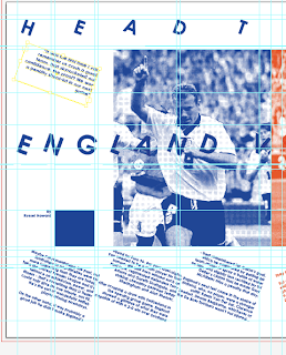
Finished layout:


I want to create feeling of two sides clashing. A feeling of England and Holland locking horns. This is the reason I opted for a blue (England) half and an orange (Holland) with the content tilting towards each other to furhter reinforce that.

Although it doesn't look that grid-like, i have followed a grid and there's use of columns and gutters throughout, i especially used them before rotating the content.

All content was rotated 20 degrees or -20 degrees, so everything is perfectly parrallel to each other which I quite like, althugh it's not at the usual horizontal or vertical angles.

I used Century Gothic Bold for the copy and main titles, mainly because I think it reads well and suits the style I went for and also suitable it was designed in the 90s. The topic of Euro 96 is obviously during the 90s.

Overall I'm fairly happy with this, I want to keep creating more layouts though. One thing I'm not happy with is I haven't been as precise as I wanted to be. My layouts I worked from haven't been measured for point size etc. I want to do this again but much more mathematically.

PARALLEL LINES ITALIC BOLD

So here's the completd typeface. I still need to make glyphs but the whole alphabet is done which is nice to see and allows me to see how the letterforms work in conjuction with each other.


On the whole I'm quite happy with it. If I have any areas I feel I need to work on, it's to work on the W and M, as the strokes have gaps between them, the counters? which are too small compared to the other letterforms. This is because the grid I used to create the letterforms in a standardised way, doesn't relate to well with 3 stems parallel to each other, it works well with 2. The only fix I can see is to rethink the grid, make it wider?


I'll work on this later but for now I'm fairly happy. Here it is:


Parallel Lines Italic Bold
Gothic Typeface


Favourite letterforms are probably, R, S, G and X as I think they translate to the logic I was working with and as letterforms on their own are pretty legible but at the same time quite interesting in how I approached them.

FRANKENSTEIN TYPEFACE: COMPLETE ALPHABET

Here is the complete alphabet for the typeface I've been working on. I'm showing light/regular/bold versions of each letterform. I can also go further and produce italic/ultrabold/ultralight etc too. I also want to put it through fontographer and get a fully fledged working typeface out of it. I need to work on the glyphs too.

Here it is so far...