
Showing posts with label Categorise and Communicate. Show all posts
Showing posts with label Categorise and Communicate. Show all posts
LAID OUT CARDS
Here's one deck laid out, each row is the different character types : hero, heroine, villain, legend and item-girl
FINAL CRIT FEEDBACK - 100 THINGS

To be fair, I think alot of the comments were fair and I knew myself the kind of things I could have improved on and what worked well and they were actually the same as the feedback I got a lot of the time.
They understoof the concept of it and mentioned Top Trumps which is good and what I wanted. I think the name also works well as it maybe gives it away.
Design Direction - They said that it's not very clear what the posters are for, and I can see their point. I kind of made them to sort of create interest in Bollywood and the movies themselves and at the same time to be a companion to the Bollywood Battle game I made. They have classic quotes which were purposely chosen to give interest. I was thinking about actually adding the actor in question's attributes from the card game and saying that you'll be able to battle with him in Bollywood Battle. The only concern I had was that the text overlay technique I used over the halftone image, didn't translate well to smaller text. There were legibility issues. They raise a good point though, I think from now I need to look at my work in a wider context and not just through my eyes.
Design Development - The feedback was positive aesthetically for the posters and stickers and that they seem appropriate for the subject with the colours etc. On the packaging though there isn't any information and it's all pretty bare apart from the Bollywood Battle logo, for something which I'm pitching that would be sold in shops this is a really valid point. I thought about it, but it occured to me way too late and there were no print slots going so I was pretty stuck and had to make do. I think sometimes I take simplicity too far.
Visual quality - Feedback was that the stickers, posters etc were well designed and would look good on a billboard although there wasn't a clear link between products and the poster, which is a fair point too. I think you probably couldn't tell they were for the same product or theme, if it wasn't for them both having the same logo in the corner. The visual style is very different on both. In fact, I made the posters afterwards when I had a little spark, I wish I could revisit the cards and apply the newer style I've developed (as seen on the posters) as I think it's quite interesting.
Technical competence - Packaging would be better if it was using stronger stock. Another fair point. The real product would likely be manufactured in factories etc and have machinery folding the paper neatly and perfectly, I think I'd have issues folding and gluing thicker stock, although that's still probably not an excuse. I need to start going above and beyond my confinements abit more. If something would be tough to stick with a glue stick, then I need to step it up and work out what to do that's best for the product and not best for me being well.. abit lazy to find a stronger adhesive?!
Overall I'm fairly happy with how they turned out although if I reflect back on my original vision, I think I only half achieved it. I've took away important lessons though and I need to start applying these little things I've learnt in the future, only way I'm going to get better.
Abbas


.jpg)


PACKAGE KNOCK UP AND FINAL VERSION
Here is the knock-up I made which i thought worked reasonably well..


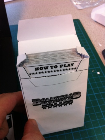
Cards fit quite snug which is what I wanted
So I printed it out on the stock I wanted which is the same off white stock I used on the starter packets, Here's the net, before I folded it up


The Bollywood Battle has printed up MUCH more sharply and the colours aren't as smudged as they are on the packets. Is it because I used a laser printer this time? With the digital dungeon being so busy at the moment and like a day until the submission, I don't think I'm going to be able to make the packets with the same printer too :(

The full deck of cards with the 5 starter packets behind.
FINISHED POSTERS
My finals are printed on antique white paper, it's a reasonably thick weight and has an off white colour, it soaks colour a lot better than standard office style paper my initial knock ups were printed on. The printers messed up abit and left these black lines, but I actually don't mind them. I guess it's a "happy accident"!


(left) standar white A3 paper (right) Same print on antique white stock with a thicker gsm and a more final version
BOLLYWOOD BATTLE POSTERS
Went for a halftone kind of screenprinted look, in preperation for screenprinting which I hope to do soon anyway. I wanted it to look quite traditional and so went for a traditional printed look. Tried to capture the different sides of Bollywood with the romance, and then the 70s action. Quite happy with how these turned out. Some photos of development and the finished products ready for print tomorrow hopefully! On some off white A2 antique white paper I reckon.


Pretty much happy with this as they are like this..


Here are some knock ups I printed on standard gsm A3 paper in the mac suites. I actually think they look quite decent, the colours are pretty bright and pop off the paper quite a bit. I'm not going to keep these as my finals though, I also intended my finals to be A2 size but with the issues with the digital dungeon at the moment and the lack of a time slot booked, I might have to make do with an A3 print but on different stock which I'm still able to do in mac/pc suites.
KNOCK UPS
Just realised the net didn't work, so I drew up some amendments and found out the problem, ha! Was a simple measurement mistake on one of the sides, I'll sort out the net, it's a good thing I made a knock up to spot this.


The closing flap could probably be a bit longer, so I'll lengthen it for the final version I'll hopefully print today or tomorrow.
This package fits alot more snug at the top
Found out the measurement mistake the facing 'bollywood' battle side isn't long enough, so i've sorted that out, which makes it fit pretty nice
FULL DECK NET
Here's some screenies of the net I've refined from the knock up. It should fit pretty snugly, I don't really see how it could go wrong.
Width: 109mm
Height: 266mm


Width: 109mm
Height: 266mm


FULL DECK BOX KNOCK UP
I think I'll go ahead with this package net, it holds pretty well. It needs to be pretty snug I don't want the cards falling around inside the case like in earlier knock ups. The length of the cards are 100mm. I gave 5 mm of give. So the length of the box is 105mm. I think its about 4mm too lose so on the final net the length of each facing side will be 101mm.
Here's some photos


Here's some photos