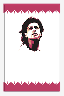
I tried to go for a patterned, more 'traditional' look but it came across as a bit too in your face. I went back to the movie ticket style and tried to refine it until I was fairly happy with it like I am now
Pretty happy with this, I need to stop niggling with it and just get all the cards done, I've still got the packaging to look into and ideally need to get it done and finalised this week for print. Let's go!


0 comments:
Post a Comment