HOW TO// Diamond Rings
Here are some basic mock-ups for ideas for this project, I like the idea of a hot dog book with a poster on one side. These are just some visual experiments contemplating a style we could use if we choose to...


How To// Ring Size Guide
Probably the most important part of buying right ring is getting the right size. From the research I realised that the differences between ring sizes are only 0.4 of a millimetre, each time but this can mean the difference between a ring that fits and one that it way too tight or too loose. There are many ring sizes as a result so fitting the ring size chart into the A6 space I am allowed may be a problem as there is no way the sizes can be altered.
 This is the first design were I basically just formed a layout on A4 format to see the range of sizes and experiment. Using Bebas Neue font as a header and a crude diamond ring separating the text as decoration. The method I would hope the buyer to use would be to hold an existing ring up to the chart to measure the correct size.
 As a group we have decided to keep the design very simple, especially in the range of colour which will be reduced to black and white. This page by nature cannot have much decoration, it has a utilitarian use and should not be cluttered for its purpose. However I can experiment with the header and its little ring stamp, this font is called Ranger, I like how it is chunky like Bebas but its height remains low which will save space when the chart is formatted to the correct A6 format. The heavy weight of the font also balances with the solid blocks of black which the chart creates.
 This is what the size guide looks like in A6 format. I have cut out some sizes from 'A' to 'D' and 'Z+3' to 'Z+8'. Realistically the only sizes people have are between 'I' and 'Z' so we consider rejected sizes as obsolete. This way we can retain the small pocket sized book while keeping the useful content also.
 This is a mockup of what the final size guide could look like. We plan on printing the whole booklet in a sort of negative white on black. I also think this will help the user measure the ring, a thin black line is easier to spot when comparing the sizes than white. The simplicity of this design is its strongest attribute in my opinion, the nature of the chart has forced me to use clean clear lines and this has resulted in a strong and balanced feel. Lots of geometry and symmetry has resulted in a design that I really like.


So we have split up the design between us and one of my tasks is to design a page of ring styles. This will have to be a very regulated process because it has to follow the design principles of the rest of the team. We are planning on using white on black text and imagery. very simple but bold design.
 I basically split the poster into three columns, classic, modern and vintage. I also wrote some clear and lighthearted information got the buyer to follow when looking for the styles and choosing them. For this design I adopted this style the rest of the group has been using to create something which will really flow with the other designs. I spent quite some time designing simple imagery for the rings that made sense. I found that the Modern style was the hardest to get across and that it really needed the text to verify the image.
 Again using the same style I designed another page for the app/ website and booklet. This one lists the settings. This page took some research and analysis to understand. It especially made me think when I had to decide how I could communicate the different settings in an easy way. Designing the images was fun because it was challenging. Each one has been refined from several versions until it was clear and aesthetically pleasing!
My concern with both of the designs is that the use of Bebas Neue as the body copy is a wrong decision, the font is too big and the uppercase is very hard to read in flowing text without imagining its being shouted at you. Although this was the plan when they were made, when the designs were copied into the app the font was changed to Helvetica by Sam. This made the text much easier to read.
I will update this post with more images of development asap.
HOW TO// Sams App part 2
Sam has posted some more images of his app on his blog. You can download the app from our website and a secure password is sent to your email. you then use the password and delete the email to log in to the app. The app contains all of our information and imagery and Sam reorganised everything to make sure it fit well on the relatively small iphone screen.
 The app icon on the phone menu page is very discrete, and should give nothing away if the possible receiver of the ring picks up the phone.
 The user will be emailed a password for security.
 This is an image of the login page, again it is discrete and wouldn't give anything away.
 After logging in the true nature of the app is revealed to the user. This is the loading screen and should not be present for long.
 This is the menu page where the user can navigate between different sections full of information.
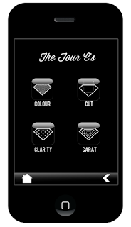 The four C's menu page will lead on to information about each. Some examples are shown below...


 The app also contains this ring size guide. The sizes are locked so the user can place a ring against the screen to judge the size.
 There is also a page detailing the different shapes of diamonds. The aim of this is that the user can consult this app before asking for a very specific ring. This is also the purpose of the screen below.

 Imogen designed a hints and tips section to help buyers look after the ring. This section is kind of strange because the receiver of the ring (and therefore the one who will care of it) is not suppose to know about the app!


The diamond ring hotdog book has been printed and folded! Its aim is to be ordered from the website and then used by the prospective buyer to help him or her to find the right ring on the move. Most information can be read on the website and then the hotdog book can be used as a kind of crib sheet.
 The lower three booklets were printed out on expensive paper and proceeded to smudge all over the place. They were basically write offs but still acted as good example pieces and forces us to used a better method. The top two books in the is image were printed off cheaply at home by Emma and turned out great. The paper made the black ink take on a very deep blue colouration and gave the book a very nice tactile feel. The off white paper also complimented the blue ink, it all turned out much better than the expensive prints.
 When you order the hotdog book you also get the ring size guide. Absolutely free!! After the success with Emma's paper on the book we printed these out on he same stuff. The ring size guide is used by the proposer, they would have to borrow a ring in secret to find out the size of the finger.
 The new paper really helped the final product of hotdog book pull together. The pattern on the back looks great too and everything just fits nicely as a series!


Sam also used our designs to add content to a website, which he designed from scratch. The aim of the website would be to front our hotdog book and sell the app. It would also contain pages and pages of information about rings much like the information found in the hotdog book and app. However its primary function would be to sell the app. Those who do not own an iPhone can consult the website and get the hotdog book and ring size chart for referencing.
 This is the homepage. It contains Abbas's logo and the page headers run across the top. We also have a little group logo across the bottom. To get to the app or mail a hotdog book the little tap with an illustrated iPhone and Envelope has to be clicked.
 If you click on the app icon you can download the app straight away from this page.
 Or order the hotdog book from this page.
Overall I think the website is pretty sleek looking. It definitely has a more masculine look to it than the average diamond ring website which is usually very feminine, which is unusual because me usually buy the ring. The white on black can be quite overpowering but ti does give it a secretive feel.


Overall I think the website is pretty sleek looking. It definitely has a more masculine look to it than the average diamond ring website which is usually very feminine, which is unusual because me usually buy the ring. The white on black can be quite overpowering but ti does give it a secretive feel.
0 comments:
Post a Comment