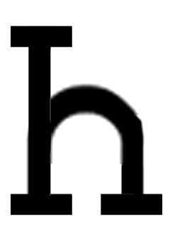
I'm going to go over with selected letterforms with the pen tool in Illustrator to give a more seamless and finished visual, but these are the initial rough letterforms I've constructed...
FRANKENSTEIN TYPE: ROUGH LETTERFORMS
Posted by
Abbas Mushtaq
on Tuesday, 10 April 2012
Labels:
Anatomy of Type,
OUGD404,
Type and Layout
Here are some of the letterforms I've come up with, some more aesthetically pleasing and proportionately better than others. I decided to scrap the idea of recreating certain letterforms and simply created whatever letterform appeared in the process, some of these are actually quite decent ideas and help me visualise how the whole alphabet and typeface could possibly look like, which is the overall aim I'm trying to work towards with this exercise.
I'm going to go over with selected letterforms with the pen tool in Illustrator to give a more seamless and finished visual, but these are the initial rough letterforms I've constructed...
I'm going to go over with selected letterforms with the pen tool in Illustrator to give a more seamless and finished visual, but these are the initial rough letterforms I've constructed...


0 comments:
Post a Comment