Processes and techniques when preparing for commercial print. Today we're looking at inDesign
Looking at swatches. Spot colours. Process colours.
Indesign is the piece iof software for layouts, especially multiple page layouts. InDesign is often the last piece where you may put all elements together from Illustrator/Photoshop before you send off for print. This session is about preparation.
Most of the time, you choose file>new>document. Even if you're doing a book. A book as far as ID is concerned is a number of ID files that are linked, e.g. chapters etc.


Always ask yourself how big the finished, trimmed and printed version will be. Excluding bleed and everything else.
Columns and margins are for guides/grids. Will assist you in your layout. Will give you consistent guides on every page of your document. 1 column = whole page is a column, don't see any guides.
Margins. Check out and research good margins for a lot of copy, like in a book.
IMPORTANT: MORE OPTIONS button

Bleed = printing over the edge of the finished product. For example colour or photos or text, it should extend over the edge of the page, you get a nice edge even if the cut is a little bit imperfect.
A common bleed amount. usually 3 mm YOU SHOULD DISCUSS THE BLEED WITH THE PRINTER FOR SUITABLE BLEED AMOUNTS.
TALK ABOUT PAPER STOCKS, SPOT COLOUR REF SYSTEMS TOO. TALK ABOUT FILE FORMAT, IS IT SUITABLE TO GIVE THEM.
Slug = area outside printed page. USED FOR CROP MARKS, REGISTRATION, SWATCHES, COLOUR SQUARES YOU SEE, DEFINES AN AREA OUTSIDE OF THE PAGE THAT WILL PRINT. not as common as bleed but still sometimes needed.
INDESIGNS' SPECIALITY IS MULTIPLE PAGE DOCUMENTS.

FACING PAGES = e.g. a book ? you'll need facing pages. Sometimes you may not need facing pages. Document will appear as it does when finished and trimmed.
INTENT

You can use ID for web, Digital Publishing = content for iPad, eBooks etc.
Primary purpose is print.
PRIMARY TEXT FRAME

If you check this, every page of the document will automatically have a text frame added. Will automatically line up with margin, each frame on each page will be linked together. Great for books, or a large body of text.

Black line = where page will be trimmed
Purple line = margin lines
Red = bleed guide
Blue = Slug area

Pages window, easily add and delete pages and navigate around the document. First and last pages are single pages, front and back cover!
USING COLOUR
Like in Illustrator, colour always has to be applied to a frame. So you can use FRAMES or SHAPES. FRAMES can contain text or images, or just for a block of colour


SWATCH PALETTE.
Default view in ID is SMALL LIST VIEW

The SQUARE represents a GLOBAL COLOUR. Enables you to create tints of each CMYK colour and automatically updates the colour of shapes and frames applied with this colour
Just like in Ai you apply the colour to the fill or the stroke.


With the frame selected you can choose to apply colour to the frame or the text within the frame. By clicking on the box with a T in or the grey square next to it.
ALWAYS USE SWATCHES TO APPLY COLOUR


ADDING SPOT COLOURS

Change colour type to spot

Once you select the relevant COLOUR SYSTEM from COLOUR MODE. It automatically pulls up similar spot colours. Click on the spot colour, in this case Rubine Red. And click Add.

You can now see it's been added into the recycle bin and you have a spot colour indication with the square and a spot in.
NEW TINT SWATCH
Select any swatch and click new tint swatch.
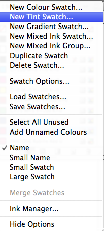


REALLY HANDY. How you can click ADD before clicking on DONE so you can get a nice list of tints without having to mess around. You can see in the screenshot above the red, with the 81% and 41% tints underneath it.
IMAGE PREPARATION
One of the problems that can arise in the print process is incorrect and unprepared images.
YOU CAN SEND ID FILES OR PDF FILES TO PRINT, in most cases
PHOTOSHOP:
1. Is it in CMYK?
2. Greyscale? For black and white images
3. Resolution and size. Is it correct? 300dpi for print
4. Actual size. Will they be perfect size for putting on the Indesign page?
5. Be careful of making images smaller. If you use huge images and shrink them in Indesign, can lead to errors, gives Indesign loads of work to do to shrink the images. > Instead, resize the image before putting it into ID.
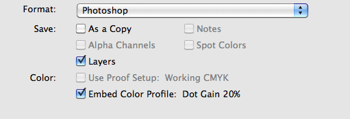
6. SAVING FILES > always work with PSD or TIFF for print purposes. PSD gives you layers, so you can get back into the file and work with transparency. So you can do CUT-OUTS and transparent backgrounds. TIFF's don't support transparency. in most cases. Be safer with PSD's.
7. SPOT Colours, have you correctly referenced them? Using Montone/Duotone/Tritone/Quadtone colour modes
ILLUSTRATOR:
1. file type. .Ai - copy and paste artwork, insto other CS software
2. CMYK. You can work with RGB in Ai too. CMYK colours within the document
WORKING WITH IMAGES
With every new document, your swatches palette is reset to default.

Placed the Lake DUOTONE. Two spot colours, tints and all that. 2 plates.
The two spot colours are shown automatically when imported in, into the swatch palette. That's why it's important to save as a PSD file so it keeps the pantone references

^Pantone 273 C + Pantone Yellow C
LINKS

Links keep info of each image placed in.
IMPORTANT: KEEP EVERYTHING IN TOGETHER IN ONE FOLDER so indesign always knows where the images are.
Also useful so you can easily edit the images in relevant software and just UPDATE LINKS
ILLUSTRATOR FILES

Illustrator files also include Pantone spot colours, look low resolution but it will print perfectly fine.
YOU CAN COPY AND PASTE STRAIGHT FROM ILLUSTRATOR
Edit>Paste


When pasting from Illustrator you don't have to worry about linked images as you've literally just added shapes which are editable into Indesign. Still high resolution too. Doesn't behave like an imported file.
GREY BIRD.
When working with a print job which is ONE-COLOUR.

You can place a greyscale tiff. You can apply colour to it in Indesign, it allows us to remain flexible right until sending for PRINT. Rather than placing a monotone/duotone image and working with it.
Click on the circle on the frame, to SELECT the image. Then just choose a spot colour, it's kind of like a fake monotone and one colour coverage.
ONLY WORKS WITH GREYSCALE TIFFS


OPENING AN IMAGE FROM PHOTOSHOP WITHIN INDESIGN
editing and updating the page.
Right click>Edit With>Software

SHORTCUT: Hold ALT + Double Click
^^ Opens the image in Preview. Default action, you can choose to change the default action for opening a Tiff file to Photoshop. Change preferences.


Now, whenever you double click on a Tiff file it automatically opens it up in Photoshop.
CHANGING TO A TRANSPARENT BACKGROUND in PHOTOSHOP
Double click the background layer to unlock it and change to a normal layer.
Use magic wand tool in this case, select background and press delete. Got a transparent background. Now MAKE SURE YOU SAVE AS A PHOTOSHOP FILE


MAKE SURE LAYERS IS CHECKED. Will preserve the transparency

IN INDESIGN

///
Indesign files when sent to the printer. making sure everything is going to work ok.


How will this look when sent to print?
Ink is applied in C, M, then Y then K. In the Offset Litho process, printing plates. One printing plate per colour, so CMYK = 4 printing plates.
When using Spot colour, it has it's own printing plate and ink colour.
How do we get to that point? How do we get each C M Y & K layer? Separated colours.
This is all done in the Print dialup box. If you normally print this you get a COMPOSITE print-out, literally prints what's on screen. Changing print settings. Indesign will seperate it into it's constituent colours, CMYK Process colours and also any Spot colours I've used, e.g. the Orange SPOT colour text above ^^^
Very important to have some idea of how each image will be separated.
Window>Output>Separations Menu

Separations MENU

Swatched saved also appear as Separations.
If you turn the view to separations

So you can see above, C M Y K and 4 spot colours.
GREAT FOR CREATING POSITIVES FOR SCREENPRINTING.

Cyan

Cyan+Magenta

Magenta
VERY SIMILAR TO CHANNELS IN PHOTOSHOP.
IN COMMERCIAL WORLD THESE SEPARATIONS ARE PRINTED ONTO HEAVY DUTY ACCETATE. SIMILAR TO SILKSCREEN PREPARATION

in the commercial print world. a printing plate will be used to create each colour and will be split up in Indesign.
There are 3 spot colours which aren't being used...

REMOVE SPOT COLOURS WHICH AREN'T BEING USED.
BLANK POSITIVES CAN SOMETIMES BE PRINTED. PREVENT EXTRA COST!
ALWAYS CLEAN OFF ANY UNUSED SPOT COLOURS BEFORE SENDING OFF FOR PRINT, PRE-PRESS CHECKS.
DELETE FROM SWATCH PALETTE, will go from the separations preview

Useful for Offset litho process. Digital print doesn't use this.
HOW TO PRINT POSITIVE
File > Print > Output
Change COMPOSITE to Separations

You can turn them off and on and separate just one colour. Click on the printer icons

Above is the orange SPOT COLOUR ONLY

Halftones ^^
CMYK HALFTONES
Grids of halftones are rotated at different angles. So as they are printed on top of each other, so the Magenta dots fall in gaps between gaps between cyan dots, to do with overlaying but also to prevent interference patterns. If you have grids that interfere.
You can have wavy lines that appear, messes with your eyes. Interference patterns.
VERY SPECIFIC TO THE PRINT PROCESS.
WHEN SCREEN-PRINTING YOU NEED SLIGHTLY DIFFERENT ANGLES,
E.G. CYAN 15%
M 75%
Y 0%
K 45%
For commercial print, you wouldn't output your positives, someone else would do that. When doing positives for your silkscreen, make sure the angles work together.
You can halftone through print or halftone in Photoshop during methods. If you halftone in Photoshop, all it is is black dots, Halftone in Indesign, only applies to a tint of a colour. Tint of a black.
Something you only need to consider when silkscreen printing really.
KNOCKING OUT / OVERPRINTING
Overlapping shapes. For example a Yellow overlapping a Cyan shape, when looking in the separation the shapes of print pretty much allow the yellow to knock out the cyan. No overlapping or colour mixing.
You can change this.
For example SPOT VARNISH. Telling the printer that the spot colour is a VARNISH OVERLAY.
How to specify? Every separation automatically knocks out the spot colour coverage, perfect for colour printing but you need it to OVERPRINT.
Window>Output>Attribute

Obviously CMYK and Spot colours are transparent, this doesn't knock out anything and allows you to overlay and work together.


When you turn the separations preview off, you won't see this until you turn it back on. SET AS OVERPRINT. you can see the shapes it literally will print two squares and allow them to overlap with transparent ink ^^^
DISCUSS WITH THE PRINTER AND MAKE SURE ALL THIS IS OK WITH THEIR PROCESS BEFORE DOING.
ONE CONSEQUENCE OF CHANGING THIS IS IT'S POSSIBLE FOR THEIR TO BE TOO MUCH INK APPLIED TO THE PAPER
Similar to Multiply function. You can use Multiply to give you a pretty good preview, and still change to OVERPRINT in separations without it affecting the separations coverage.
Overprint Stroke would be used in a process called trapping. Something you apply when printing, google search this out.
0 comments:
Post a Comment