
As part of the What is Design For Print brief, one of the biggest aspects of it is gaining knowledge before I even share the knowledge through the info-pack. This is a brief that will require a lot of engagement and personal investigation as that's the best way to learn and become familiar with things.
The first book I'm going to read and make notes on is Layout by Ambrose & Harris. It's not exclusively for print production but it touches on important elements of designing for print such as grids, hierarchies, layout, binding etc and if anything it's something I could use generally anyway to become more familiar with handling type and image for layout.
I'm going to record my notes and important points taken from the book. Hopefully it'll educate me on basic aspects and also plant a few seeds moving forward for this brief. I hope to read this over the weekend and make a start on reading Print & Finishing by the same authors which will be a little bit more focused on the brief in hand
///
Layout concerns placement of text and image elements within a design. How these elements are positioned, both in relation to one another and within the overall design scheme will affect how the context is viewed and received the by readers.
Layout can help or hinder the receipt of information presented in a work.
-The Basics
- The Grid
- Elements of A Page
- Form & Function
- Layout in Use
- Breaking the Rules
Use different stocks throughout the info pack to communicate a point about stocks and the influence they have on print finish?
There are no golden ruls to creating layouts, with the exception that that the content must come first. For example as a guide book communicates its content in a very different manner to that of a thesaurs - layouts are not transferable per se.
"The use of the grid as an ordering system is the expression of a certain mental attitude inasmuch as it shows that the designer conceives his work in terms that are constructive and orientated to the future.'
~ Josef Muller-Brockmann
BASICS: IMPOSITION
The arrangement of pages in the sequence and position in which they will appear whien printed. Knowledge of how a publication is physically put together is important before beginning a page layout.
The book is printed on four different stocks. Matt, uncoated, gloss and kraft.

It's good to draw out an imposition plan in rows of 4's or 8's or even 16's as it's a multiple of 4 and allows you to view your double page spreads well and clearly. You can also work out which sections will be in which stock and how it will all flow visually at a glance.
Stocks can have variations in colour feel and weight. Gloss stock will feel lighter than matt stock as gloss's finer surface is more compact.
Rougher surface of pulpy, uncoated stock will feel thicker to touch. Subtle differences can go a long way and can be found between matt and gloss stocks.
Imposition is probably less critical with a simple four colour CMYK or single colour print as every job will print with the same colours but it can help with the introduction of specials such as a spot colour or a fluorescent colour.
Colours on the matt stock appear to be brighter than the muted tones on the uncoated stock. It is worth remembering that paper stock selection will have on the final result, especially on colour and image reproduction.
Paper Stocks
Chromolux - high gloss cast coated board that is white on one side and provides a brilliant surface.
Gloss - Coated paper that has a polished, high-gloss surface. Also called glazed or cast-coated.
Silk - Has a low-gloss, dull finish that looks a little like canvas. It allows for easy die cutting and scoring. Also known as satin.
Offset - a commodity paper made to be a high volume, economic paper for printing. It has a smooth or vellum finish, but may also include patterning.
Blame Everyone Else. Client Paul Davis. Design Browns
This book uses a total of 13 different paper stocks and really uses this aspect of publishing creatively. Often having mirror board stock reflecting text from the opposite page. So the text on the opposite page is written back to front - ready to be reflected.
Stock changes can imply collation. As if you are thumbing through someones personal scrapbook.


Tipped-in sections
A tipped in plate is an illustration not bound into the book but glued to the edge. Or sometimes bound into edges of the publication such as the top or bottom edge of publications usually on a different stock to the pages behind. The 'Plate" is the illustration, when they're often referred to as tipped-in plates. Used a lot in the old days as a finer and more special way of including illustrations and photos.

Working With Pages
A page is a space in which to present images and text. To do this effectively one must consider the purpose of a publication and it's intended audience.
Format characteristics such as the printing method and print finishing specifications such as binding are key considerations for a page layout.
For example: is it to be read up close, or far away? For example a magazine, is read further away than a book so adjust the layout and pt size accordingly.
Usually magazines are 14pt and novels/books are 9pt.

RECTO/VERSO
RIGHT page/LEFT page
Designer Alan Fletcher devised a master page design which had a page layout which concentrates on central layout that concentrates on central blocks to give a logical and paced placement of images.
Like his work for Phaidon Press series: Art & Ideas
LAYOUT: THE SYMMETRICAL GRID
In the symmetrical grid the verso (left) will be like a mirror for the right page, this kind of grid is often used for books with a lot of content and novels too.
Jan Tschichold the German typographer pioneered ratios and 'ideal' measurements for the symmetrical grid.

Within a symmetrical grid you can have loads of variations, using columns which are symmetrically mirrored.
Often what works really well is a two column grid with the outter column acting as a sort of supporting column with headings and instructions for example

THE BASELINE GRID
Type is positioned on the baseline, some letters such as 'o' are usually slightly bigger and sit a little bit below the baseline. This is because if it sat on the baseline like say a 'd', it would appear smaller and would ruin the visual fluidity of the font.
You can also use a combination of type sizes accompanying headings and the like to fit on to your own baseline grid. For example one line of a 24pt set solid font next to 2 lines of 10 point + 2 pt leading fonts would still line up and sit on the baseline as 10pt +2pt +10pt+2pt = 24 pt coverage.
HYPHENATION OR JUSTIFICATIOn
Sometimes you have situations in a narrow column where word spacing and letter spacing along with justified text can make the paragraph a little ugly to look at with unsightly gaps in sentences. You ca adjust the minimum, optimum and maximum justification settings to allow the paragraph to look a bit more appealing and easier on the eyes. You can also adjust letter spacing and set widths to fine tune this.
WORD SPACING
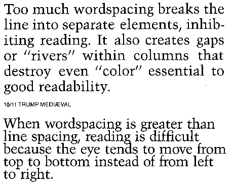

Increasing word spacing can result in a 'whiter' body of text; conversely decreasing it will result in a more solid or 'grey' appearance.
LETTER SPACING
Increasing or decreasing the distance between the letters of a word (letter spacing) affects the appearance of the word, as it controls the extent to which one letter is allowed to occupy the space of another letter.
HIERARCHY
Logical, organised and visual guide for the headings that accompany body text. Denotes varying levels of importance through point size and/or style.
A heading = normally used for title of the piece. Largest point size, and greatest weight to be dominant
B Heading = smaller point size, lighter weight than A head maybe. Larger and heavier than body text, may be incorporated for chapter headings.
C Heading = May be same point size as body text but italic or underlined to use for captions maybe.
EXQUISITE CORPSE
(cadavre exquis) is a surrealist technique that exploits the happy chance of accident in the production of words or images.
similar concept as the 'consequences' game whereby several people have to write or draw on a piece of paper, then fold it and pass it on to the next person, who then repeats the action, in the end we get a complete piece of type, image and weirdness.
This same concept is applied by designers, with the exception that the elements are deliberately selected or formed so that they will be compatible, as the example below shows..
Client: Bodas
Design: Rodas Design
Layout Synopsis: cross-cut pages provide exquisit corpse.
Rose Design created a one colour catalogue where it was cut horizontally through the middle. So in effect you could alter and play around with outfits for the models. Very clever and suitable for it's purpose.
BINDING
This is a format choice that directly affects layout, in particular the margins!
Different binding methods such as perfect binding and saddle-stitch binding produce very different overall physical attributes of a product.
Pefect bound publications require a larger margin than normal as when the book is bound together, it will be pinched at it's spine and it'll lead to problems.

Wiro-bound publications should have no content in the margins at all as it will be punctured in the binding process.
SWATCH BINDING
Typically a swatch is used for colour system swatch books as they're quick and easy to glide through and get to where you want and also good to compare to other colours in the swatch book. Perfect for comparing colour.
Sometimes this is used to actually bind portfolios in design too. Such as Imagination's design for Ericsson which was a bolt-held swatch format.
INDEXING
Thumbnail indexes. Giving dominance to the thumbnails which could highlight key sections of the book or maybe all sections.
STRUCTURED AND UNSTRUCTURED LAYOUTS
Absence of a structure can be used to your advantage to convey some kind of feeling or effect in the design. Sometimes unstructured layouts can be very creative, but it's one of those cases where you need to know the rules and how to manipulate the readers attention before you break the rules.
PASSE PARTOUT
The term can be applied to the borders around the outside of an image or page element within a layout.
A passe partout can be manipulated to change the relationship between type and image and the overall feel of the page you're looking at it, for example if you want it to feel condensed and tight or open and free.
JUXTAPOSITION
The deliberate placement of contrasting images from completely different contexts. In GD this can be used to present two or more ideas so as to impart a relationship between them.

BREAKING RULES: WORKING WITHOUT A GRID
Working without a grid is sometimes not a problem, depending on the kind of visual effect the designer wants to put across.
Similarly sometimes a designer might design something to look like there's no grid, although he's used one as there are no 'logical' design decision such as adjacent or parellel paragraphs and so on.
Structure is still provided and care has been put into margins etc but there's no obvious use of grid and can lead to a more 'disorganised' experimental aesthetic style making the viewer work a bit more.
David Carson is one of the most famous experimental designers out there when it comes to layout.
0 comments:
Post a Comment