


^^This doesn't have any rhyming words, it'll be the cover for the booklet.
First I need to make them all look black and white like the top one is, with the same amount of noise and little tweaks. After this I'll need to make them all about 7.425 cm x 10.5 cm and then lay them out onto the spread.
Here's how I put it together in Photoshop

A4 size layout for the spread

Here's the actual page size artboard, I used the artboard so I could effectively crop each photo to the correct page size, and then import them into the layout.

Size of photo in relation to the artboard


Here it is with the masks above it to create the desired affect

CENTURY GOTHIC BOLD typeface. This is the temporary logo

Used guides to line up the lines above and below the 'THREE'

Volume 1 is also in Century Gothic Bold.

Wasn't happy with the tracking, so increaseed the tracking to a 100


I did the same tracking of 100 for the THREE text aswell.

Tested placing


Knock up above was very helpful for me to know the order and orientation of each section on the digital layout which you can see below..

PRINTED OUT
THREE: VOLUME 1


Fold out poster side (above), along with the answers and initial layout,

Needs cropping! On the finished piece I'll print onto paper bigger than I need so I get full bleed.

Cover

Photos 1 and 2

Photos 3 and 4

Photos 5 and 6

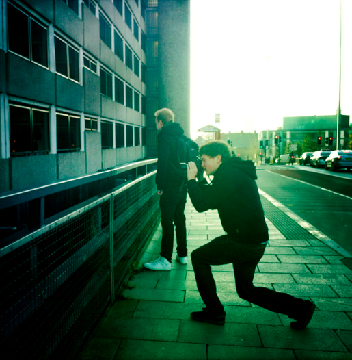
Photo 7

Poster side
0 comments:
Post a Comment