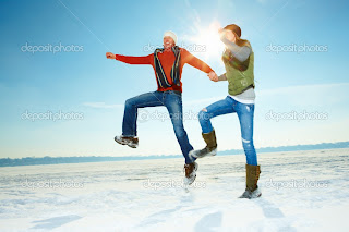
I like these more 'vintage' ones more I think it'd look better than some chavs prancing around, especially considering the umbrellas look quite kind of 'posh' too
This is a good image, walking away from the umbrellas might bring the message home a bit more
silhouettes won't really suit the halftone umbrellas, i need a photograph to work from really
This is my favourite so far, I think it could translate well to the photo. A little silhouette of a couple in the distance dancing.
This pretty much sums up my poster! It seems to be quite a popular painting though so I might look a bit silly just using the same silhouette from what could be a classic painting that everyone at D&AD knows, who knows...?!


0 comments:
Post a Comment