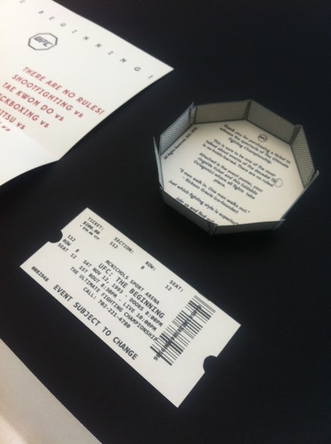
Here are my products for a UFC 1 rebrand. What a customer would receive in 1993 when ordering the first UFC event!


Feedback:
Strengths
- Packaging works well as a set, good size and everything fits in well
- Very clear as to what it's for, it's text and imagery make it obvious
- Very functional, good poster layout.
- Design is effective, maybe not retro but very stylish and still attractive
- Flyer is very original, functional and innovative. Works very well
- Good use of stock
- Size of packing is spot on, would be exciting to receive.
- Set of products clearly represents through color scheme
- Ring format flyer is clever and adds viewer interest, plus interaction.
- Egg shell/off-white stock adds to retro aesthetics
Areas for improvements
- Ticket could be as interesting as the poster and flyer, more graphically involved with set.
- Watch spelling errors
- If a retro style is trying to be achieved, maybe use cage on the other packaging
- Maybe change the type to something more retro
Notes (building on points underlined above)
- As much as people say the packaging works well, I think it could do with more improvement, if you see the photos above, the poster is the largest object in the package. When folded it's still the largest and fits into the poster lengthways. The envelope is needlessly wide with too much slack.
- If the envelope was a bit more snug in width and height it could make the experience of pulling out the content nicer and easier to pull out. Now I have the measurement of the poster when printed and folded exactly, I can make the envelope more snug.
- One spelling mistake, noticed so far anyway! On the flyer, I've typed "Thi" when it should be "This"
- Using a more retro type is a good point, maybe examine retro prizefighting posters a little bit more in terms of typography. I used a pretty contemporary typeface released in 2012 - Edmondsans Bold. I did want to give it a contemporary twist but this is definitely something I can explore and hopefully improve the poster as a whole.
Action plan:
Take into consideration all the points made by peers and the notes I made on the feedback. I'd definitely make the envelope less wide and more snug and explore alternative typefaces more. Apart from that I'm pretty happy with the ticket and flyer. The feedback for the flyer has been surprisingly positive which is good as I wasn't too sure about it at first. It folds up and closes nicely with the flaps making a sort of lens effect
0 comments:
Post a Comment