Summary of the workshop:
Colour
Swatches
Spot Colours
Swatches
Pantone references
Tints
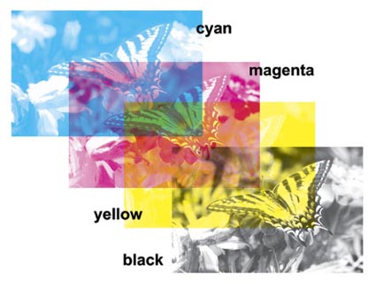
CMYK colour OR 4 Colour OR subtractive model - works with an absence of colour with transparent inks designed for printing on paper and combining to create colours
In Industry CMYK is referred to as PROCESS COLOURS
Each colour has different amount of colours in a diferent place to combine and make a full colour
Print is 300 PPI/DPI
Web is 72 DPI/PPI
Print is CMYK
Web is RGB an additive colour model
CMYK's all combine to make Key. A kind of muddy brown, still need some actual black to make it into a full K100% black. A black spot colour?
Neutral grey is the best colour as a backdrop for colour specific work, often in industry and professional studies, a neutral grey is used as it's not as overpowering as black and white. You can change this from Illustrator>Preferences>User interface
Using Swatches
Using swatches adds consistency and efficiency to your workflow and finished product. It is also cost effective if for example you are working with a system where only two colours are used and you overprint some colours for example mixed cyan and yellow to make greens, but still using 2 colour plates in the print process.
You can create your own swatches.
Select "all unused" in the swatch options and click delete. It keeps what you've used in the artwork so far.
Registration often has a crosshair or in the small list view has a black colour, not to be confused with black, K100%. Registration is used for manually placing crop marks/fold lines etc.
When printing C M Y K. Registration marks are applied by the printers on each colour layer, Cyan and Magenta each have their own registration marks.


* YOU SHOULD ALWAYS, OR ATLEAST TRY TO HAVE A GOOD IDEA ABOUT YOUR COLOUR PALETTE IN YOUR WORK AND SET UP YOUR COLOUR SWATCHES BEFORE YOU BEGIN TO DESIGN AND ADD ELEMENTS.\
\


You can change your view options from the swatch options. I found my favourite was "Small list view" as you cn see above it gives a lot of information at a glimpse, it gives you the CMYK values and tells you if it's a spot colour or a global swatch or whatever.
You can change the ink mixture by double clicking on it.
When you ADD USED COLOURS it automatically adds the colours you've used and makes them GLOBAL COLOURS

GLOBAL SWATCHES
Global swatches are swatches with an established link between them and the colour on your artwork. So they automatically change on the artwork as you change the CMYK mixtures of them, which can work to your advantage if it's needed.
So for example if you have a 100% Cyan global swatch and you make tints from it as new swatches which are 90% and 80%. If you change the 100% cyan to a 100% magenta, the tints will remain but the ink colour will change, cutting out the hassle for you.
You can change tints on global swatches, unlike with normal swatches through the colour palette menu.

Really good for when you want to use one colour but want more variations and different colour, same ink mixture and cost, just different tints - opacities of prints.


SPOT COLOURS
A process colour is a mixture of CMYK. A spot colour is just a A colour. It's colour isn't made up by layering C M Y and K. it's a ready mixed colour
Similar to buying a tub of paint from paint shop.
A spot colour is cheaper. don't mix 4 colours for example - which would take 4 passes through the printing presses. Spot uses one printing plate. One ink and one plate. Cost effective and may possibly lead to a much sharper and vivid print, sometimes layering ink can lead to a kind of dotty and unsmooth aesthetic. Like a yellow which may have 5% Magenta, looks very similar to 100% Yellow but has an extra layer of magenta, and added double cost.
Spot colours are consistent. The plate is the same everywhere, so it's very good for branding logos and identities.
For example, heinz beans and heinz ketchup need to have the same colours everywhere, so they will most likely use spot colours and have a reference code that is a universal language and the printers can look into different colour systems and pick it out and apply it.
Pantone Swatches
Example of a spot colour is a Pantone Swatch.
Assigning a spot colour in software is easy. Once you apply the spot colour as, in this case a Pantone swatch, once fed into a printer or when the professional printers on the other side see it they will know it's a spot colour and the printers will take care of it and apply one coat of ready mixed ink instead of CMYK layers.
Pantone is the most widely used reference system in EU and UK. Other colour systems are...

Before you even speak to the printer you might talk about what spot colour reference to use from the pantone swatches and they'll know straight away what colour to use, or you might show pantone swatches to a client.
With spot colours you can print flourescent and metallic inks. Just check out the relevant colour systems. This isn't possible with process colours mixing CMYK, they are only able to do so much.
To get up a Pantone colour system it's real easy. Open swatch library>Colour books>Pick system,

Pantone Solid Uncoated^^ for example. You can change this to Small List View just like with the colour swatches and get a handy search option which makes it even easier to cross-reference.

So for example I searched 354 and BANG.

Click once and it's added to your swatch menu.

NEVER CHANGE THE NAME OF A SPOT COLOUR! Can lead to problems for referencing when sending off work and printing.

^^The dot in a square signifies this is a spot colour.

SAVING A SWATCH
Very easy.

AI library files only open in AI. ASE, opens in any other Adobe suite program such as InDesign and Photoshop.
Opening a Swatch.
When opening a new document, the swatches are reset to basic CMYK models.
Can delete these easily as previously mentioned.

Opened a saved swatch now you can add them.
Till next session, ok bye
Abbas
0 comments:
Post a Comment