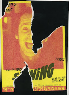
I've been meaning to do this for a while, and finally got round to it and I'm quite chuffed with the results. The concept for this poster was for there to be two posters, perfectly lined up with the top poster ripped to bring the one underneath through and to emphasise the horror movie aspect, along with the different personalities of Jack Nicholson's character Jack Torrance.
I actually printed off the two posters and ripped and scanned them for real rather than drawing a fake tear and it gives a much richer visual effect and I like how it's very slightly misaligned giving it quite a nice movement and feel which is relevant to the aim.
I feel this is better than the original version and this is now the final iteration of the poster and deliverable for this particular brief.
////////////////////////////
Looks pretty decent in black and white too like a grainy black and white movie, quite eery.
Both of these can be blown up to A2 size, which I plan to
/////////
Individual elements .


0 comments:
Post a Comment