The Dieline Package Design Awards are a woldwide competition devoted exclusively to the art of consumer package design. The Dieline Package Design Awards were launched in 2009 in order to bring more awareness to the importance of well-designed packaging.
The competition is mainly aimed for professional packaging and industrial designers and well established brands but we though't we'd have a crack anyway. The brief is very open and simply asks to see innovative and well designed packaging design.
After some thought and debate me and Seb decided to give ourselves no more than two days - a quick turn around brief focused on redesigning Heinz Ketchup packaging.
We outlined what we liked about the recent Easy Squeeze bottle and what we didnt, and also what made Heinz packaging recognisable.
What we like
- The squeeze element and pressure gauge when s
- The ergonomic shape of the bottle
- The idea of logo being upside down, prompting you to place the bottle lid-down, for less ketchup being stuck
What we don't like
- Confusion with upside down logo, people still sometimes place bottle lid-side up, defeating the purpose
- Ketchup getting stuck at the opposite end. Meaning ketchup wastage
- Palming the bottle of the bottle when ketchup is running low
Recognisable features
- Bottle shape
- Heinz sticker
- Heinz colour palette
- Signature Heinz ketchup red
//////////////////////////////////////////////////////
Brief Title:
The Dieline Awards_Heinz Ketchup
The Brief:
Rebrand and redesign the Heinz Ketchup bottle. Building on previous developments to create a unique and innovative new solution, being careful not to alienate existing customers, but at the same time having an element of surprise and excitement.
Background & Considerations:
Existing Heinz adverts, be careful not to create too extreme and outlandish an advert unless you can justify it.
Research into colour palettes and general themes and specifications in terms of point size of existing adverts and packaging by Heinz
Mandatory Requirements
Research into existing opinions and perceptions of Heinz and their Ketchup packaging
Blogging and design development showing design decisions and process from early framework to the finalised artwork.
Deliverables
Boards/images sent and uploaded to The Dieline awards competition by the deadline
Interactive PDF of presentation boards uploaded and posted to design practice blog
Boards for project compiled with other live briefs as part of your Responsive Project Report
Deadline
01/04/2013
//////////////////////////////////////////////////////
___Concept
Our main concept after some discussuion is the idea is to literally give the bottle two lids, having two lids makes no sauce get stuck, it's not possible to place the bottle the 'wrong way' and there's no bottom, so sauce can't get stuck at the bottom. All sauce is accessible and apart from some possible issues such as alienation of existing customers through design - in terms of effectiveness and usability we can't think of any reason why it shouldn't exist.
The concept was Seb's who took charge of the concepts while I took more prominence when it came to artworking and throwing in a few suggestions in terms of the advertising and copywriting aspect.
Our original idea was to call the bottle Heinz 360. Developing on the idea of turning the bottle round and using any way you want - the bottle would be symmetrical and makes sense any way you look at it, we decided on Heinz 69. The number 69 is horizontally symmetrical and is perfect for our 'no right way up' concept.
___Design Development & Process
We took this photo to edit and manipulate as we just don't have enough time to physically make a new bottle.
I straightened the sloped edges to make it easier and more logical to have two lides, two sloped edges meeting in the middle with two lids would look odd and unlike Heinz.
With two lides mirrored on top of each other.
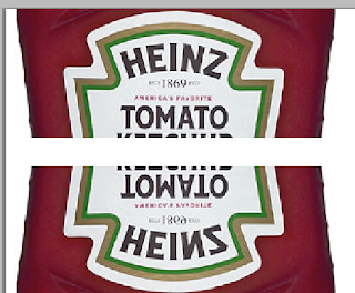
The logo designed by Seb, the badge is literally mirrored so any way up it's read exactly the same, so you can place the bottle however you want.
The current Heinz sticker shape isn't horizontally symmetrical. So we changed it to be symmetrical but we were careful to not change the shape too much and keep the iconic curvature at the top.
Placing and embossing into the bottle.
Looking into existing Heinz adverts we were unhappy with the white background, it didn't make you feel hungry, it didn't have a richness about it. We went for red, a colour subconsciously related to food and richness, which links directly to the food product and taste we're advertising.
The lighting o nthe bottle is off and looks too dull and unprofessional and not slick enough.
After a lot of tweaking we got a lot closer to what we wanted, with this...
This is pretty much the most substantial portion of this brief so the next logical thing to present will be our presentation boards. Which will be in the next post


0 comments:
Post a Comment