
The two colourways in action, can't decide between the two right now, I'm hoping this is resolved after the final crit.
Close up of the logo

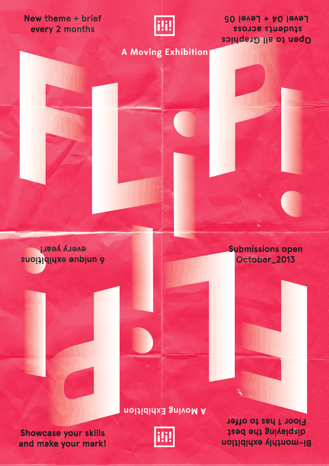
The i's represent the order and orientation in which you see the i's when looking at the poster and reading FLiP! They also represent the dynamic and moving nature of the exhibition, constantly shifting.
Maybe if I put in two extra i's and make it six, the movement will still be there but it can signify 6 exhibitions
Some process and layout experimentation screenshots:


This was how the original thumbnail laid out the text but in reality it just didn't sit comfortable with me,

I accidentally did this and quite liked it, it has a nice movement to it and each letterform almost looks like it's own isometric plane and surface.


I updated the logo to also give it the angles.

Grid for the logo, very simple to make


I was originally planning on doing the black into the backgorund colour but the mid tones stand out too much I couldn't get rid of the greyness between the black and red

White worked much better when seeping into the background.


Flipped and made sure they were both perfectly aligned so when spinning the poster 180 degrees nothing moves

Logo is also perfectly symmetrical both ways up and sits within the grid, dead centre


Also making the copy angular seemed way too overboard!

I found placing the copy difficult, I purposely chose 6 separate bits as I decided an even number will give an equal amount of information to distribute and make symmetrical in terms of placement.

Finished layout.
Outdoors promotion mock-ups__


0 comments:
Post a Comment