//
ONCE YOU KNOW THE RULES, YOU CAN BREAK THEM.
This is what adds credibility, can let your work down aswell.
Make-Up Of Type
Books - Stop Stealing Sheep, Ambrose and Harris
- Components
- Weights and sizes
- Styles
x-height - height of x in the specific typeface/font
cap height = height of actual letter block
Ascender is a part of a letterform that exceeds the boundaries from the top, Descender is a part which descends below the baseline.
Kerning = space between a pair of letters (two) that need specific attention
Tracking = the space between lines of a whole paragraph
Leading = space between lines, olden days they used to stick lead in between each line of letterblocks to create line gaps.
Gutters = space between each column, on grids etc
Bleed = over-run of colour and shapes or other visual information, apart from body copy, to get a crisp finish when trimmed.
Typeface = letterform, physical typeface
Font= computer typeface, digital.
TYPE FAMILY
ROMAN
ITALIC
Thing
Light
Regular
Semibold
Bold
Extrabold
Condensed
Extended
Light Condensed
Semibold Condensed
Bold Condensed
TECHNICAL STUFF, LAYOUTS
DPS = Double Page Spread
Points, Picas n' Ems.
No space between type, e.g. no leading. Is called 'SET SOLID'
Leading = Space between letters.
Putting it into practice...
For example if a typeface measured 10pts from top of the ascender to the bottom of the descender, it's a 10 pt typeface. If the top of the ascender, to the top of the next ascender below = 14pts... this means the leading in between the two lines of text is 4 points as 14-10 = 4.
The way you would specify this is...
10/14 pt
(Point size/Point size including leading)
10/14 Helvetica Regular
^^If someone say this, they'd know exactly what to do and how much leading to specify, no matter what scale theyre working to, it'll be the same.


Most of the language terminology used in todays digitial age, such as kerning and leading etc is traditional from the old days.
One 12pt is 1 Pica em
1 em is divided into 12 pts
1pt = 0.35mm
1 em= 12pts
1 em = 0.35x12mm = 4.2mm
Usually people set up dimensions to mm and type into points
Measure = line length
e.g.
10 Picas (120 pts across) = roughly 24 characters
20 Picas = 48 characters (48 letterforms, spaces etc)
Average line, 6 words a line..
48 ÷ 6 = 8 words = 12.5 lines
Good for quick approximations for educated guess about type and space needed for it. Good to have inclination. People are paying you and expect you as an expert graphic designer, to know.

When you put Pica scale on top of type to measure, you need to line up the ascender with the top of the measuring lines, as you can see here.
In this case it lines up nicely with 9 picas, in the 12pts gauge. So the point size in this case is 12x9 = 108 pts.
Reason for standard font sizes you find in digital software and in letterpress is they basically made them out of metal, alot of space and time and effort needed, no point working in small .5 inclinations. So they had a sort of standardised 'default' sizes such as 48, 72 etc.
Measure scale, multiply by pt size.
x heights
pt.size = body copy size.

You can see here, it's the same point size but they don't all line up. That's why the x-height is very specific to each typeface.
Ligatures = two letters that link together, Goes back to days of letterpress when kerning a pair of letters was difficult, and they'd have to basically be minus kerned, something you cant physically do with two blocks, but can do digitally. Still used nowadays, for efficient ink coverage. Sometimes ink bleeds etc and ligatures are useful for that.


USING TYPE
Readability
Hierarchy = headings, sub heads, running heads, into, body, captions, folios
e.g. As a basic rule, the most readable line length is between 9-12 words per lines. Especially taking into account communicating effectively to a wide variety of people, e.g. dyslexic people who might have trouble reading long lines.
Carry out an investigation maybe into this stuff, see what I deem readable against something which is less readable, compare things like leading and line length etc to find out myself what is more readable.
Specials, Breakouts, 'Pull Quotes', Drop Caps
Pull Quotes = Big quote in the middle of a paragraph. Often seen in magazines. Really important to seduce the viewer in.
READABILITY
CAPITALS - Disguises shape and difficult to recognise, almost like a silhouette wearing a hat.
Lowercase - More shape and character, like removing a hat from a silhouette, gives alot of information away.
Different typeface - Like seeing the silhouette turn into photo, can have alot of character and give a good idea into personality.
Transport Medium Bold = Designed for Motorwards. First used in Preston bypass in 1958. Lowercase on purpose as our brain reads the shape in some mad crazy clever way and we can read it in an instant from far away. This shape and recognition is something that Uppercase characters lack.
Q)So is Uppercase more eyecatching and readable really?
Quite often need to kern specific letters to make things look good together.
Numbers are particularly difficult because of the body copy size around the letters, causes some difficult spacing between letters. Noticable once you know!
BEFORE
1 958
AFTER
1958
Helation = effect of white or light spreading against a dark background
Reverse Out = Colour out of a background, e.g. reversed out of the background e.g white stock, black background text box, ink bleeds into 'negative space' letterform.
You can solve this by making text heavier, more space for text and increading tracking, so increasing space between letterforms.
SERIF WORKS BETTER THAN SANS SERIF
CMYK = A background may be made out of a bit of C, M, Y and even abit of K maybe. Harder to reverse out of a multi coloured background, you get foamy edges on your typeface and looks abit odd. See if you can notice it next time.

You're gonna come across these little issues at some point as a designer, it's unavoidable. It's important to know how to fix the issue. Learning curve.
MINUS LEADING - Only available digitally, as letter blocks can't just overlap, physically impossible.
SET SOLID is type to type.
Don't ever just accept default type settings, nothing wrong with changing it. This is your job as a designer to make an informed decision. You have an opinion, use it!
Some words need to be in certain typefaces to just work. E.g. 'ROMAN' needs, to be in a slab, serig style typeface, not handwriting or it'll look dumb.

On the other hand, easily recognisable words such as SALE can work in any typeface, pretty much.


^beautiful.
Type has a big cultural aspect. E.g. Cooper Black..


Fonts for emotion, e.g. Anger, Joy etc
Can be creative with body copy, Once you know the rules you can break them. Braking out of body copy, e.g. in the Alice In Wonderland book.
TINTS
STRENGTHS
WEIGHTS
LAYOUT
Application - bible, cook book etc
e.g. on a cookbook there's a lot of white space around the edges, big use of white space. to take into account dirty cooking hands
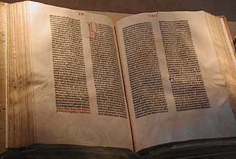
bible - space on sides for person to stand at the front and hold with hands at both sides and read, column grids, centered.
Scripts - breakouts, to increase imphasis on words.

Tracking - Always do loads of layouts, pen paper, ruler. With same content, but experimenting with hierarchies and placement of the same content, keep at it and you'll keep refining and hopefully end up with something interesting and polished at the end. Get into it and enjoy it.
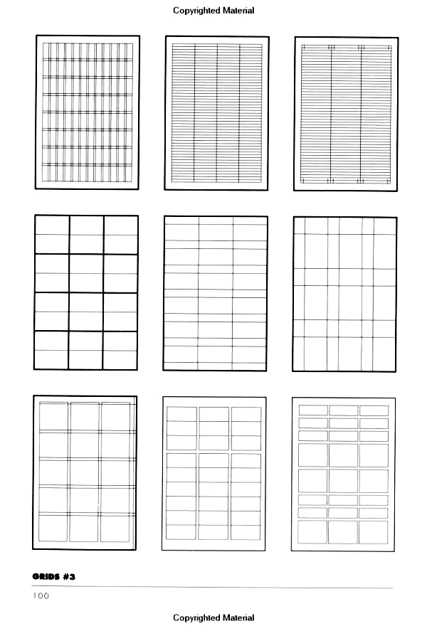
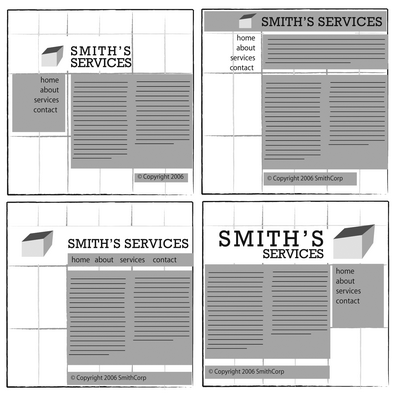
GRIDS
Thoughtful layouts, how would they physically interact with it? Start thinking about this
Layout thumbnails
The minature size should reflect the size+weight, don't just skimp on it and use thick pens, when you don't readlly want that effect. I guess havin a thin pen, would be more efficient as you can make the line thin and thicker as you wish.
THE GRID IS YOUR FRIEND!
*Guardian won lots for award for their layout and grid. A mix between tabloid style and European style. Size is abit bigger than other papers such as Daily Mail but still big enough for the train etc and the layout is flexible but easy on the eye.
*The same grid can be used for really, different layouts. Don't be constrained by it, it's just a guide, to keep whatever you want in line, in line and spread out nicely and evenly.
Drop caps


0 comments:
Post a Comment