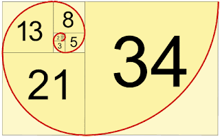
Fibonacci Sequence
Ratio: 8:13
in design and nature
Matter of proportion
Mona Lisa, perfect spirals and proportions.

"Aesthetic quality to these proportions."
Series of numbers: Each number is the sum of the previous two.

PROPORTIONS!
Helps when it comes to layout as for example you might have a 55 pt size heading, this means technically a 34pt font for subheading or copy is the ideal size to be aesthetically pleased proportionally.
GOLDEN SECTION
Fibonacci sequence ratio of 8:13 links to golden section ratio
It's all about balance.
1.62 is the Golden Number
Comes from beautiful Egyptian and greek design.


For example 56cm long rectangle, divided by 1.62 gives you 35. Which means divide it into one shape of 35, with a 21 cm shape on the side. Which gives you an aesthetically pleasing proportion easy on the eye, carry on dividing the 35 to get a complicated grid.
21+22+13 for example

Make it then Break it!
The rule of thirds. KERN ME! game
Golden Spiral - eye naturally moves towards POI. Negative space in the less stuffy areas.


Twitter for example is a good example of the golden spiral as a result of the fibonacci sequence.

WORKSHOP TASK:
Really enjoyed this task, literally we just had to DO IT. Make a booklet or some form of readable visualisation of type and grid visualising and educating a viewer on what we already know in 2 hours.
Here's my effort:
/////
TAsk for next week:
make your own paper size using principles such as Fibonacci sequence - start with a 3x5 square instead of a simple 1x1 for interesting paper sizes and then apply type proportions to make something 'correct'
0 comments:
Post a Comment